
The chart below show information about honey-bee colonies and honey production in the US.
T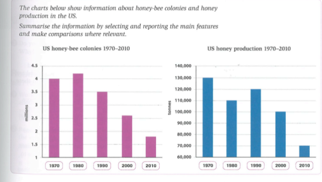
he chart give information about the numbers of honey-bee colonies and phony production in the United State from 1970-2010.
There were 4 millions honey-ice colonies in 1970. However, these measures rose to 4.2 millions in 1980. But over 30 next years. These amounts decreased to 1 million every ten years. For instance, From 1990-2010, these numbers dropped from 3.5 millions to 1.8 millions
In 1970, the quantities of honey production were 130.000 tonnes. Differ from 1970, the honey productions fell 110.000 tonnes in 1980. But at the next 10 years, it suddenly went up 120.000 tonnes in 1990. Then, the measure of honey productions continually decreased every 10 years. Detail, in 2000 and 2010, these measures dropped respective 100.000 tonnes and 2010.
Generally speaking, The charts show that the quantity of both bee colonies and honey production have fallen during the 40-year period. Though, the relationship is not really concerned with each other. Because, when colonies rose in 1980, honey production fell. On the other hands, when colonies decreased in 1990, honey production increased.
Thank you so much!
Top answer
The chart (What kind of chart? ) give information about (information is a very general term. It might be the size, the colors, the weight, and other parameters.
- The chart (What kind of chart?
- ) give information about (information is a very general term.
- It might be the size, the colors, the weight, and other parameters.
- Be specific.
- What is actual plotted on the chart?
Get the Weekly English Kit 📬
New words, one handy idiom, and a 2-minute quiz — delivered to your inbox to keep your streak alive.
The chart (What kind of chart? How many are there?) give information about (information is a very general term. It might be the size, the colors, the weight, and other parameters. Be specific. What is actual plotted on the chart? What is the frequency of the bars?) the numbers
 Related Questions