
The chart below give information about levels of education in Glasgow, a city in Scotland, in 2010.
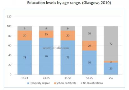
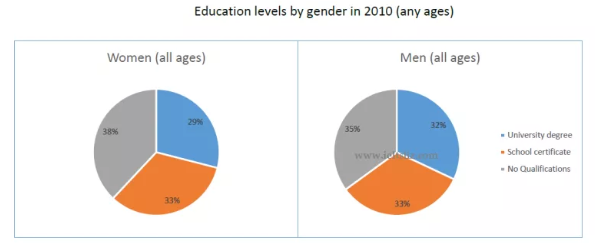
The bar chart and pie chart illustrates the percentage of education levels by genders and age range in Glasgow, a city in Scotland, in 2010. The information provided three different education levels which are University Degree, School Certificate and No Qualification. Overall, the age groups embrace a total of University Degree's education level in the bar chart was primarily colossal of five age items. Regarding the pie chart, No Qualification has the highest percentage of educational certification that any genders were achieving with all age. Furthermore, University Degree has a massive amount the greatest proportion from 21 to 35 age range (76%). In addition, there is a subtle difference between School Certificate and No Qualification at over 75 age, slightly more people who were without certificated than men and women have a diploma in school( 72% and 3% respectively). In terms of School Certificate, out of the five age ranges, in each proportion from 16 to 75 age ranges which have slightly fluctuated 15% and 20% respectively. Moreover, it has corresponded percentage of both genders (33%). Compared to, No Qualification's aged 16 to 50 was one and the same percentage is 9%.
Top answer
The bar chart and pie chart illustrates [singular/plural ] the percentage of education levels by genders and age range in Glasgow, a city in Scotland, in 2010. [ This gives the impression that we have a breakdown of educational level by gender, subdivided by age group, which is not the case. It might be better to make this two separate sentences, one for the bar chart, and one for the pie.
- The bar chart and pie chart illustrates [singular/plural ] the percentage of education levels by genders and age range in Glasgow, a city in Scotland, in 2010.
- [ This gives the impression that we have a breakdown of educational level by gender, subdivided by age group, which is not the case.
- It might be better to make this two separate sentences, one for the bar chart, and one for the pie.
- ][ How many age groupings are there?
- What are the age ranges?
Get the Weekly English Kit 📬
New words, one handy idiom, and a 2-minute quiz — delivered to your inbox to keep your streak alive.
The bar chart and pie chart illustrates [singular/plural] the percentage of education levels by genders and age range in Glasgow, a city in Scotland, in 2010. [This gives the impression that we have a breakdown of educational level by gender, subdivided by age group, which is not the case. It might be better to make this two sepa
 Related Questions