
The bar chart
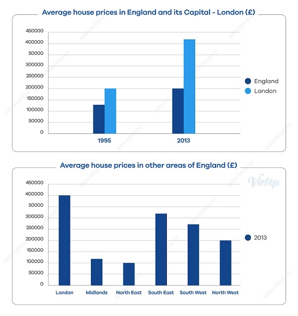
The bar charts illustrate the average house expenses in England and its capital city – London, and to present the comparison regarding the average house prices between distinct areas of England within the year 2013.
The first bar chart compares England versus its capital city, London in terms of change of average accommodation price in two separate years 1995, 2013. The accompanying bar chart demonstrates the difference in house prices in six specified regions of England in 2013.
Overall, there was a significant increase in the medium price of the country and its capital city, although London houses ‘prices overwhelmingly exceeded the national average and other areas of England.
In 1995, people living in London spent 200.000 pounds on accommodation compared to roughly 130.000 pounds on the national average. After 18 years, the gap between them became larger, as the medium houses’ prices in London accounted for over 400 thousand pounds, two times higher than that for the state average.
To be more specified, being moderately above the average, housing prices in South East, South West, North West ranged between 200 thousand and 310 thousand pounds while the cost of houses in Midlands and North East was slightly lower, approximately 120 thousand.
Get the Weekly English Kit 📬
New words, one handy idiom, and a 2-minute quiz — delivered to your inbox to keep your streak alive.
 Related Questions