
The bar chart
-The bar chart illustrates the amount of people live in four different countries from 1950 to 2002 and projection for 2050.
-Generally, the proportion of India's population in a period of 100 years is a gradually rise, different from the other three nationalities. In 1950, the population in China was the highest, about 23 percent. This was higher than the smallest population abiut 20 percent. In 2050, having interesting thing, the percentage in India and China is similar, at 15 percent.
-The population in USA in 1950 was only as a half in India and after that, which was slow dropped to 2002. From 2002 to 2050, USA has stable population over the period.
-The description of chart shows the proportion of Japanese is very little. And this will slight fall to 2050.
-In brief, the graph shows the percentage of the total world population in four countries in a period 100 years provides information for development of each country.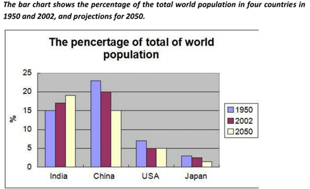
Top answer
o Duong Nguyên The bar chart illustrates the amount of people People don't come in amounts; they come in numbers. Sugar comes in amounts.
- o Duong Nguyên The bar chart illustrates the amount of people People don't come in amounts; they come in numbers.
- Sugar comes in amounts.
Get the Weekly English Kit 📬
New words, one handy idiom, and a 2-minute quiz — delivered to your inbox to keep your streak alive.
Th?o Duong NguyênThe bar chart illustrates the amount of people
People don't come in amounts; they come in numbers. Sugar comes in amounts.
What are the instructions, Th?o Duong Nguyên?
The title on the bar chart has a bad spelling mistake.
-The bar chart illustrates the amount (wrong word) of people (missing word) live (wrong form) in four different countries from in 1950 and
 Related Questions