
[task1] Please help me. I'm having IELTs next month. thank you
The bar chart below shows the percentage of people living alone in five different age groups in the USA between 1850 and 2000.
Summarise the information by selecting and reporting the main features and make a comparison where relevant.
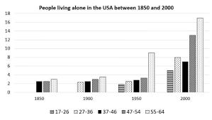
The bar chart compares the proportion of US citizens in 5 distinct age groups who lived alone from 1850 to 2000.
Overall, the percentage of people living alone in all age groups increased over this period. The aged 55 to 64 living alone in the US is the most popular group.
In 1985, 3% the 55-64 age group who lived alone in the US compared to approximately 2% people among 37-46 and 47-54 age group each. In 1900, there was a small increase of 1% in the proportion of both the 47-54 and 55-64 years old.while the percentage of those aged 37 to 46 living alone remained stable in comparison with 2% that of 27-36 age group.
In 1950, there had almost 2% those aged 17- 26 who lived alone in these years and the percentage of US citizens living alone rose according to age group. In 2000, the people living alone in the US was highest among the 55-64 age group, with 17%. The comparable figure for those aged 47-54 lived alone came a close second at 13%, was almost double that for the 37-46 age group. The percentage of US citizens who lived alone was 10 % and 5% in the age group of 17-26 and 27-36 respectively.
Top answer
The bar chart compares the proportion of US citizens in 5 (Write small numbers in words. - five) distinct age groups who lived alone from 1850 to 2000. (Incomplete first paragraph.
- The bar chart compares the proportion of US citizens in 5 (Write small numbers in words.
- - five) distinct age groups who lived alone from 1850 to 2000.
- (Incomplete first paragraph.
- What are the age groups?
- How many groups of bars are there or how frequent are the bars?
Get the Weekly English Kit 📬
New words, one handy idiom, and a 2-minute quiz — delivered to your inbox to keep your streak alive.
The bar chart compares the proportion of US citizens in 5 (Write small numbers in words. - five) distinct age groups who lived alone from 1850 to 2000. (Incomplete first paragraph. What are the age groups? How many groups of bars are there or how frequent are the bars? )
Overall, the percentage of people living alone in all ag
 Related Questions