
Task 1: The graph below shows information about the total oil consumption of four major consumers from 2009 to 2030. Summarize the information by selecting and reporting the main features and make comparisons where .Task 1: The table below shows...
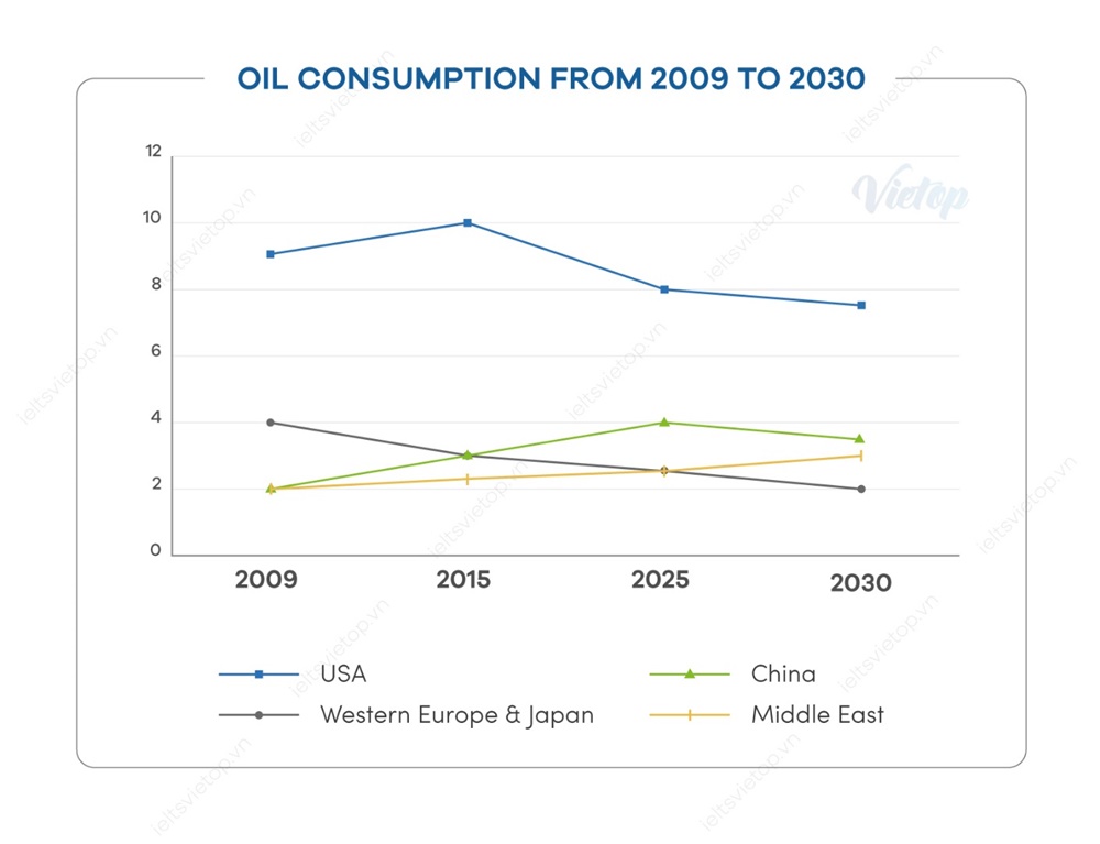
Task 1.1.The line graph demonstrates the daily oil consumption of four different countries specifically the USA, China, Western Europe, Japan and Middle East between 2009 and 2030 with predictions.
Overall, the USA was the biggest consumer of oil in 2009 and is predicted to remain the largest until 2030.
Looking at the chart in more detail, in 2009, the oil consumption in the USA was about 9 million barrels a day. This figure increased to 10 million in 2015 then is expected to decline significantly to under 8 million barrels in 2030. Meanwhile, Western Europe and Japan consumed 4 million barrels of oil in 2009 and the daily consumption of oil in there has been decline since. It is predicted to reach at 2 million barrels per day by 2030.
In addition, Oil consumption in China and the Middle East was all around 2 million barrels each day in 2009 before starting to rise. By 2030, the figure for the Middle East is expected to gradually grow under 4 million barrels of oil and it for China would reach about over 3 million barrels per day with a few fluctuates. Unit: million barrels per day
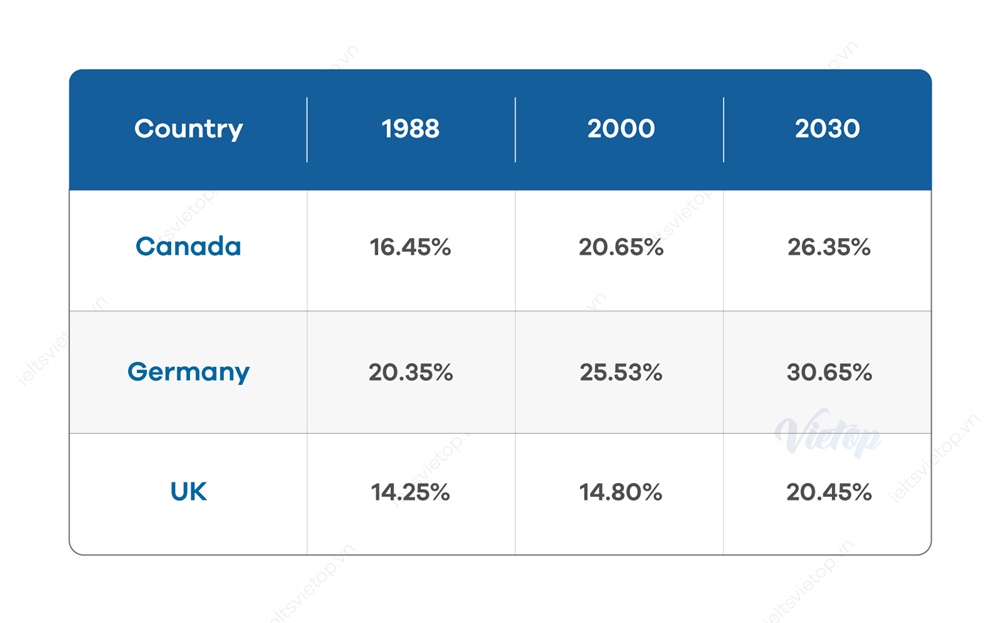
Task 1.2.The given table illustrates the percentage of people being 65 years old in Canada, Germany and the UK in 1988, 2000 and the prediction by 2030
Overall, Germany had the highest percentage of the population aged 65 and over in both 1988 and 2000, while the UK had the lowest from 1988 to 2000. This trend was expected to remain until 2030.
To be specific, in 1988, over 20% of the German population was aged 65 and above, while the figure for Canada and the UK population was 16% and 14% respectively. By 2000, nearly 26% of German people was aged 65 and over, compare to 20.65% of Canada population and 14.8% of the UK citizens.
In 2030, the German population’s percentage is expected to reach around 30% whereas, the percentage of Canadian population aged 65 and over is predicted to be 26% and about one-fifth of the UK population aged 65 and above is expected in 2030.
Top answer
Please post essays, paragraphs, dialogues and other writing in the essay forum so a moderator does not have to move your post. htm Please put the essay instructions with your answer in the message body. Subject: Please review my IELTS essay Message body: Topic: Put the essay instructions here with the image.
- Please post essays, paragraphs, dialogues and other writing in the essay forum so a moderator does not have to move your post.
- htm Please put the essay instructions with your answer in the message body.
- Subject: Please review my IELTS essay Message body: Topic: Put the essay instructions here with the image.
- The graph below shows information about the total oil consumption of four major consumers from 2009 to 2030.
- Summarize the information by selecting and reporting the main features and make comparisons where ...
Get the Weekly English Kit 📬
New words, one handy idiom, and a 2-minute quiz — delivered to your inbox to keep your streak alive.
Please post essays, paragraphs, dialogues and other writing in the essay forum so a moderator does not have to move your post.
https://www.englishforums.com/English/EssayReportCompositionWriting/Forum9.htm
Please put the essay instructions with
Please do not include two essays in one post. Make two posts, each with the essay instructions, the image of the graphic, and your answer.
The line graph demonstrates (Poor word choice) the daily oil consumption of four different countries specifically the USA, China, Western Europe, Japan and Middle East between 2009 and 2030 with predictions.
(not a good expression)
Overall, the USA was the biggest consumer of oil in 2009 and is predicted t
Sample essay. This is too long, but will give you ideas how to combine categories to get a high score. Just copying numbers from the graphic will not get the best marks! I used the graphic that I posted, not yours, which did not shoe the units of measure on the Y-axis.
The line graph compares the oil consumption of four regions of the world (the US, China, Middle East and Western Europe
 Related Questions