
Task 1 TEST 2
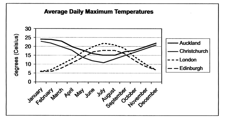
The line graph below shows the average daily maximum temperatures for Auckland and Christchurch, two cities in New Zealand, and London and Edinburgh, two cities in the United Kingdom.
The line graph illustrates the change of temperature in two particular counties with four different cities including Auckland, Christchurch, London, and Edinburgh on a regular basis during a 12-month period.
In general, the initial impression from the chart is that the alternation of temperature was inversely proportional to separate geological positions. It is notable that the highest temperature in the UK was registered in summer while the winter months in New Zealand experienced the hottest atmosphere.
As can be seen, both cities in New Zealand saw a similar trend in terms of average daily temperature. January was the hottest month in Auckland and Christchurch, reaching its peak at approximately 23 degrees. Their figures declined significantly, with some fluctuations reaching a low of 110C in July for the former and 150C in August for the latter prior to recovering almost their initial levels in the last month of the year.
It is apparent that also mirroring the trajectory was two cities in the UK. Both cities witnessed the coldest temperature during the first months of the year, with roughly 50C. However, the subsequent five months saw an overall increase of 150C to peak their highest points at over 200C in the middle of the year before also dipping to the same level around December.
Get the Weekly English Kit 📬
New words, one handy idiom, and a 2-minute quiz — delivered to your inbox to keep your streak alive.
 Related Questions