
Task 1 test 12
The graph below gives information about how much people in the United States and the United Kingdom spend on fuel.
The bar chart compares expenditure on fuel between the US and the UK. The amounts are shown for people in each of three income brackets, high, average, and low.
Overall, the percentage of income spent on fuel generally gets higher in the UK, whereas it decreases in the US.
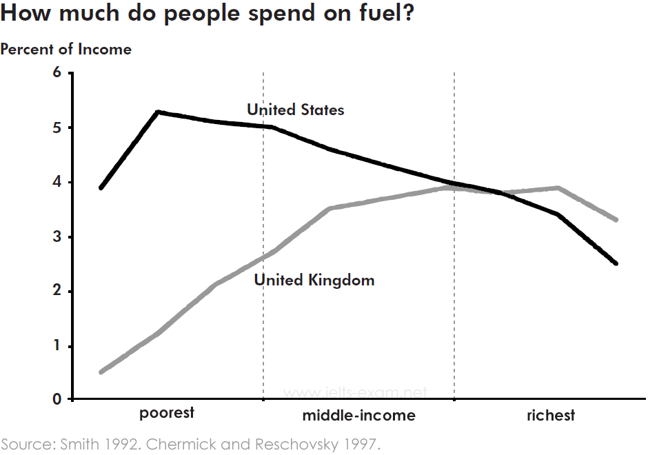
There was a major discrepancy between the poorest and the wealthiest expenditure, which is greater in the UK than in America. The spending on petrol by the poorest in the US was four times bigger than that of English people, at nearly 4% and 1% respectively. By contrast, both the richest people in America and England allocated around 3% for fuel.
In the USA, the percentage of income spent by the poor can be twice that spent by the rich. However, in the UK. the percentage spent rises quite steeply for the poorer members of the population but then remains almost constant apart from the very richest, where it falls again. In both countries, people on middle incomes spend about the same percentage.
Top answer
Please review my essay. Thank you
- Please review my essay.
- Thank you
Get the Weekly English Kit 📬
New words, one handy idiom, and a 2-minute quiz — delivered to your inbox to keep your streak alive.
The bar chart (It is not a bar chart.) compares expenditure on fuel (That is now exactly correct. Amounts are not in dollars or pounds. ) between the US and the UK. The amounts are shown for people in each of three income brackets, high, average, and low. (That is not correct either -
 Related Questions