
Task 1 TEST 11
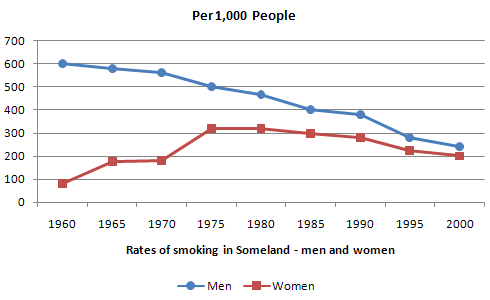
The graph below shows the rate of smoking per 1000 people in Someland from 1960 to 2000.
The line graph compares the ratio of smokers among 1000 females and males in Some land over a four-decade period starting from 1960.
Overall, there was a major decrease in the rates of men using cigarettes while an upward trend was observed for the proportion of female smokers.
In 1960, approximately three-fifths of men smoked, six times higher than cigarettes usage in women. In the next five years, the percentage of smoking for former decreased to 580 people, continuing to fall steadily a further by 100 to 500 around 1975. While the rate of female smoking had a great increase of 100 people before remaining unchanged until 1970, followed by surging at its highest point at over 300 per 1000 people.
From 1980 onwards, both the percentage of female and male smokers shared a relatively similar trend. Both figures declined gradually, dropping to 200 people, almost to the same in 2000, which shows that the percentage of female ratio doubled in 40 years.
Top answer
) in Some land over a four-decade period starting from 1960. Overall, there was a major decrease in the rates of men using cigarettes (We do not "use" cigarettes. ) while an upward trend was observed for the proportion (wrong usage) of female smokers.
- ) in Some land over a four-decade period starting from 1960.
- Overall, there was a major decrease in the rates of men using cigarettes (We do not "use" cigarettes.
- ) while an upward trend was observed for the proportion (wrong usage) of female smokers.
- In 1960, approximately three-fifths of men smoked, six times higher than cigarettes usage in women.
- In the next five years, the percentage of smoking for former (wrong usage) decreased to 580 people, continuing to fall steadily a further by 100 to 500 around 1975.
Get the Weekly English Kit 📬
New words, one handy idiom, and a 2-minute quiz — delivered to your inbox to keep your streak alive.
The line graph compares the ratio of smokers among 1000 females and males (incorrect wording - which group of 1000 are you writing about?) in Some land over a four-decade period starting from 1960.
Overall, there was a major decrease in the rates of men using cigarettes (We
Sample essay:
The line graph compares the rates of smoking for men versus women in Someland from 1960 to 2000.
The smoking rate is defined as the number of people who smoke out of 1000 people in their population sector. In this 40-year period, the rate for men was always higher than for women, and the largest difference was at the beginning. By the end of the period, the gap h
 Related Questions