
(task 1) Please help me by checking this essay.
Energy produced by different sources in one country in 1985 and 2003
The pie charts below show the proportion of energy produced by different sources in one country in 1985 and 2003.
Please help me by checking this essay. Thank you!
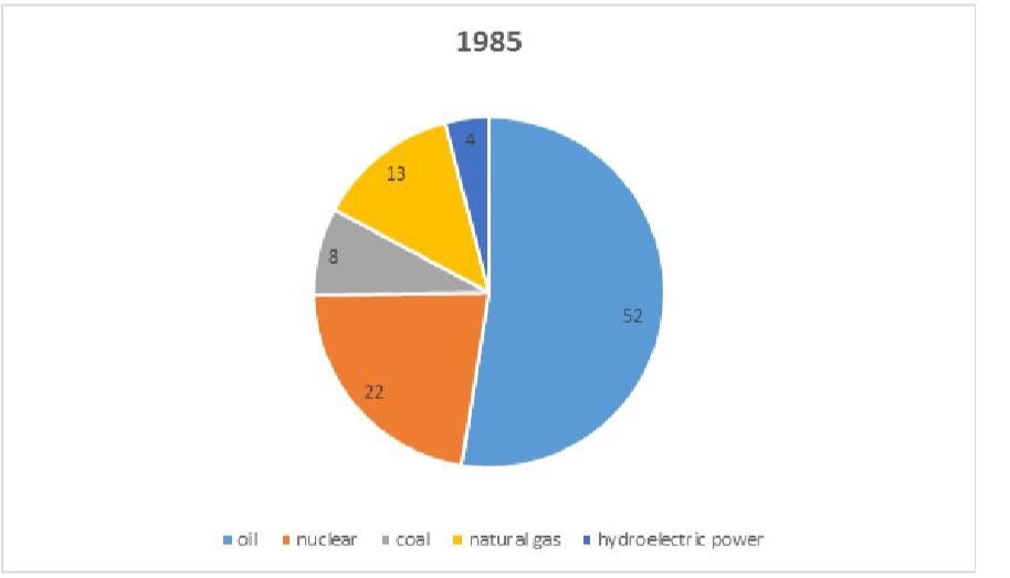
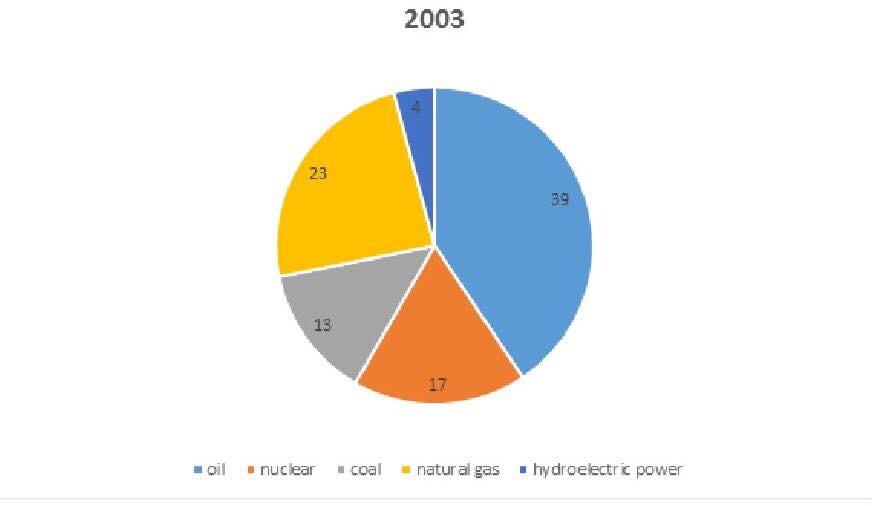
The two pie charts compare the percentage of energy generated by oil, nuclear, coal and natural gas and hydroelectric power in a country over the period from 1985 to 2003.
Overall, while the proportion of energy produced by oil and nuclear showed an upward trend, and opposite trend was applied to coal and natural gas. The majority of energy in both two years produced came from oil.
In 1985, slightly over half of total energy was generated by oil at 52%, decreasing rapidly to 39% by 2003. Similarly, starting off from 22% at the beginning, the percentage of energy from nuclear power witnessed a rapid decline to only 17% in 2003.
In contrast, there was an increase in the portions of energy created by coal and natural gas. The figure for natural gas rise rapidly by 10% from 13% at the starting point, making this source of energy hold the second rank. At the same time, a slighter rise was applied to coal from 8% to 13% throughout 28 years. Meanwhile, the fraction of hydroelectric energy remained unchanged at the rate of 4% as the least common resource in generating energy.
Top answer
The two pie charts compare the percentage of energy generated by oil, nuclear, coal and natural gas and hydroelectric power in a country for two different years over the period from 1985 to and 2003. (It does not show any of the years in between these two, so the phrase "over the period" is not right. ) Overall, while the proportions of energy produced by oil and nuclear showed an upward trend , increased (Trends cannot be seen in two points of time.
- The two pie charts compare the percentage of energy generated by oil, nuclear, coal and natural gas and hydroelectric power in a country for two different years over the period from 1985 to and 2003.
- (It does not show any of the years in between these two, so the phrase "over the period" is not right.
- ) Overall, while the proportions of energy produced by oil and nuclear showed an upward trend , increased (Trends cannot be seen in two points of time.
- ) and opposite trend was applied to those of coal and natural gas decreased .
- ) years produced came from oil.
Get the Weekly English Kit 📬
New words, one handy idiom, and a 2-minute quiz — delivered to your inbox to keep your streak alive.
The two pie charts compare the percentage of energy generated by oil, nuclear, coal and natural gas and hydroelectric power in a country for two different years over the period from 1985 to and 2003. (It does not show any of the years in between these two, so the phrase "over the period" is not right. You are comparing
 Related Questions