
[ task 1] please correct my writing. thank you a lot.
The graph below shows different sources of air pollutants in the UK from 1990 to 2005. Summarise the information by selecting and reporting the main features, and make comparisons where relevant.
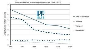
The line graph compares four distinct atmospheric pollutant sources in the UK in terms of the million tonnes emitted between 1990 and 2005.
Overall, the total amount of air pollutants in the UK fell during the period. of all pollutant sources, the industry showed the most significant fall.
In 1990, the number of air pollutants in the UK totaled 7 million tonnes, which was the highest value in 15 years. After a sharp decrease of 3 million tonnes in 1999, the total amount of air pollutant slightly declines to approximately 3.2 million tonnes at the end of the period.
In 1990, the industry accounted for 5.5 million tonnes of the number of air pollutants, compared to households which emitted to the air 0.9 million tonnes. In 2005, the number of air pollutants created by industrial activities decreased to 2 million tonnes, 1.9 million tonnes higher than that of households. even though there were minor fluctuations, the number of air pollutants generated by transport remained relatively constant at about 1 million tonnes from 1990 to 2005.
Top answer
The line graph compares four (wrong word) distinct atmospheric pollutant sources in the UK in terms of the million tonnes emitted between 1990 and 2005. The units of measure are millions of tonnes of pollutants. (Incomplete first paragraph.
- The line graph compares four (wrong word) distinct atmospheric pollutant sources in the UK in terms of the million tonnes emitted between 1990 and 2005.
- The units of measure are millions of tonnes of pollutants.
- (Incomplete first paragraph.
- ) Overall, the total amount of air pollutants in the UK fell during the period .
- of (wrong capitalization) all pollutant sources, the industry showed the most significant fall.
Get the Weekly English Kit 📬
New words, one handy idiom, and a 2-minute quiz — delivered to your inbox to keep your streak alive.
The line graph compares four (wrong word) distinct atmospheric pollutant sources in the UK in terms of the million tonnes emitted between 1990 and 2005. The units of measure are millions of tonnes of pollutants. (Incomplete first paragraph. What are the sources of air pollution?)
 Related Questions