
Task 1- please check it
The graph below gives information from Annual Energy Outlook 2008 about consumption of energy in the USA since 1980 with projection until 2030.
Summarise the information by selecting and reporting the main features, and make comparisons where relevant.
The line graph reveals the usage of six different energy resources from Annual Energy Outlook 2008 in the USA since 1980 and makes the prediction until 2030. Six categories are Petrol and Oil, Natural Gas, Coal, Nuclear, Solar/Wind and Hydropower.
Overall, Petrol and Oil had the highest number of consumption among all classifications. Not at all, there was an upward trend for most of those, except Hydropower.
In detail, the energy usage in Petrol and Oil was 35 quadrillion units in 1980 and was volatile until 1995. From 1995 onward, there is a dramatic increase, in particular, it reached 43 quadrillion units in 2015 and it is predicted to have 48 quadrillion units in the next 15 years. Besides, in Coal, 15 quadrillion was the number of consumption in 1980, more sharply to 22 quadrillions in 1995 before stabilizing unchanged that figures until 2007. It is projected to finish at over 30 quadrillions in 2030.
To all remaining categories, they had similar rates in the future. While Natural Gas began with 20 quadrillion units in 1980, the others had only under 5 quadrillions in this time. 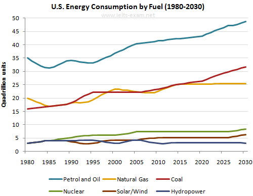
Until the year 2010, all categories had a fluctuation and they are predicted to remaining their number from 2018 to 2027, namely, 20%, 7%, 5% and 3% for Natural Gas, Nuclear, Coal and Hydropower respectively. Finally, the energy usage of Hydropower always under 5%
Top answer
The line graph reveals plots the usage amounts of energy consumed from six different energy resources (wrong word) from Annual Energy Outlook 2008 in the USA since 1980 and makes a the prediction until 2030. The s ix categories (sources) are Petrol and Oil, Natural Gas, Coal, Nuclear, Solar/Wind and Hydropower. ) Overall, Petrol and Oil had the highest number (wrong word.
- The line graph reveals plots the usage amounts of energy consumed from six different energy resources (wrong word) from Annual Energy Outlook 2008 in the USA since 1980 and makes a the prediction until 2030.
- The s ix categories (sources) are Petrol and Oil, Natural Gas, Coal, Nuclear, Solar/Wind and Hydropower.
- ) Overall, Petrol and Oil had the highest number (wrong word.
- ) of consumption among all classifications.
- Not at all, T here was an upward trend for most all sources of those , except Hydropower.
Get the Weekly English Kit 📬
New words, one handy idiom, and a 2-minute quiz — delivered to your inbox to keep your streak alive.
The line graph reveals plots the usage amounts of energy consumed from six different energy resources (wrong word) from Annual Energy Outlook 2008 in the USA since 1980 and makes a t
 Related Questions