
TASK 1 (Pie graph)
Hello teacher, I just wrote an essay for task 1 in the IELTS test.This is the first time I have analysed the pie graph, so I am not sure about that. Could you please check it for me and give a sample for this essay? When you did that for these bar and line graphs, I realized that I could learn easier and knew how foreigners write an essay.
Thank you.
You should spend about 20 minutes on this task.
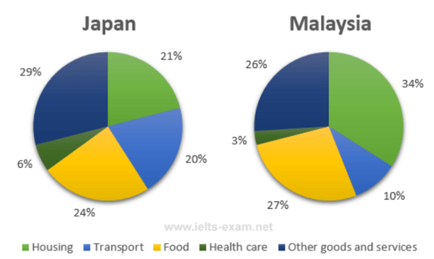
The pie charts below show the average household expenditures in Japan and Malaysia in the year 2010.
Summarise the information by selecting and reporting the main features, and make comparisons where relevant.
Answer:
The percentages of five different household categories spent by Japanese and Malaysian in 2010 are shown on the pie graph. These are housing, transport, food, health care, and other goods and services.
Overall, people in these two nations spent the largest proportion of their income on three specific categories: housing, transport, and other goods and services. The percentage presenting for transport and health care in Japan was exactly two-fold of Malaysia.
Malaysian gave priority to spend on the housing group, which occupied the highest value (34 percent) of the total expenditure. It was a factor of about one and a half times of Japanese, which just put 21 percent to the same category. In terms of food, the figure for Malaysia was 27 percent, which was barely higher than of Japan, about 24 percent. However, people in Japan mainly spent their money on other goods and services, at 29 percent, which is 3% higher than of Malaysian.
The expenditure on health care was lowest in these categories in both countries, 6 percent for Japan and 3percent for Malaysia. Transport in Japan and Malaysia, second only to health care, only occupied 20 and 10 percent respectively.
Top answer
nh Quang The percentages of five different household categories spent ( 1) by Japanese and Malaysian ( 2) in 2010 are shown on the pie graph . ( 3) These ( 4) are housing, transport, food, health care, and other goods and services. 1.
- nh Quang The percentages of five different household categories spent ( 1) by Japanese and Malaysian ( 2) in 2010 are shown on the pie graph .
- ( 3) These ( 4) are housing, transport, food, health care, and other goods and services.
- 1.
- We do not spend categories.
- We spend time or spend money.
Get the Weekly English Kit 📬
New words, one handy idiom, and a 2-minute quiz — delivered to your inbox to keep your streak alive.
Vu Lê Hu?nh QuangThe percentages of five different household categories spent ( 1) by Japanese and Malaysian ( 2) in 2010 are shown on the pie graph. ( 3)
 Related Questions