
Task 1 owned and rented accommodation
Kindly help me with 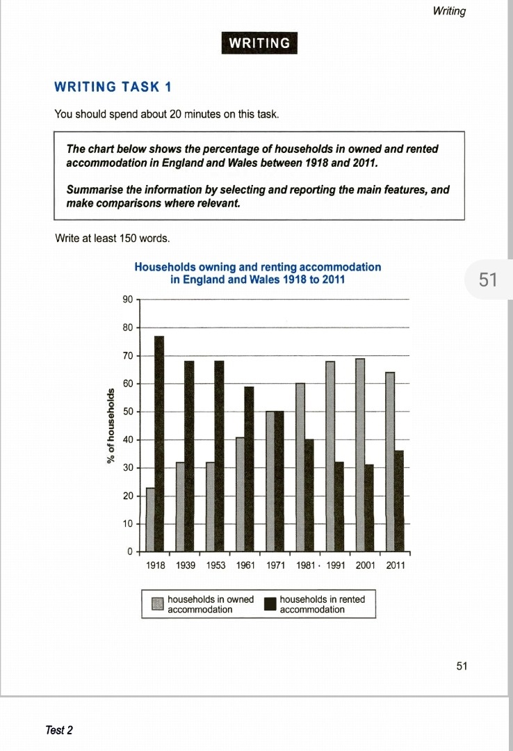
this task 1.
The given bar chart compares the percentages of families who lived in rented or owned accommodations in England and Wales from 1918 to 2011.
Overall, the graph presents that the trend of living in a rented house decreased from 1918 to 2001, except for the last 10 years when a small rise in percentage is noted. On the other hand, families living in owned accommodation increased over the years.
Number of families who lived in their own houses grews throughout the years. In 1918, just under one fourth of the households preferred to own their houses, this number saw a steady rise and reached its peak in 2001 at 70%, after which it dropped slightly by 5 percent in 2011.
In 1918, a majority of families lived in rented houses. This number was at its highest at just over 75% at the start of the period . It continuously fell over the years to 30% in 2001, before increasing to 35 % in 2011.
Top answer
You missed the most significant aspect of this chart. The sum of rented + owned is always 100%. So if the percent of renters changes, that of ownership must change in exactly the same amount but in the opposite direction.
- You missed the most significant aspect of this chart.
- The sum of rented + owned is always 100%.
- So if the percent of renters changes, that of ownership must change in exactly the same amount but in the opposite direction.
- This shows that you did not take time to study the chart before you started to write the essay.
- If you state this relationship in the "overall" paragraph, you then can choose to write about only one of them; the other is the mirror image.
Get the Weekly English Kit 📬
New words, one handy idiom, and a 2-minute quiz — delivered to your inbox to keep your streak alive.
You missed the most significant aspect of this chart. The sum of rented + owned is always 100%. So if the percent of renters changes, that of ownership must change in exactly the same amount but in the opposite direction.
This shows that you did not take time to study the chart before you started to write the essay.
If you state this relationship in the "overall" paragraph, you th
 Related Questions