
TASK 1 - Line graph. Glad to get some feedback from you.
TASK 1 - Line graph - #10 - 10/05/2022
The line graph below shows the oil production and consumption in China between 1982 and 2006.
Summarize the information by selecting and reporting the main features and make comparisons where relevant.
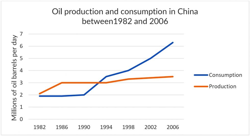
The line chart illustrates how much oil was produced and consumed in China over the course of 24 years starting from 1982. Units are measured in millions of barrels on a daily basis.
Overall, China witnessed significant growth in the amount of petroleum it manufactured and used over the period. Remarkably, the figure for oil generation dominated that for oil consumption over the initial years of the period, yet the opposite tendency could be seen in the remaining years.
In 1982, around 1.8 million barrels were consumed, 200 fewer than the amount of petroleum produced. Whilst daily oil output rose dramatically to 3 million in 1986 prior to a subsequent stagnation at this point, oil usage underwent a steady rise, with its figure growing to 3.5 million in 1994.
From this time onwards, the amount of petroleum manufactured maintained its upward streak, albeit at a moderate level, and eventually reached a high of approximately 3.8 million in 2006. Meanwhile, the statistics of oil consumed surged with an exponential gradient, making a more than two-fold leap to 6.1 million in the last year alone, almost double that of oil generation.
Word count: 197 words
Thank you in advance ^^.
Top answer
Read my advice for Task 1 essays. IELTS TASK 1: Hints, Tips And Advice Vocabulary Words For Task 1: Reference Post
- Read my advice for Task 1 essays.
- IELTS TASK 1: Hints, Tips And Advice Vocabulary Words For Task 1: Reference Post
Get the Weekly English Kit 📬
New words, one handy idiom, and a 2-minute quiz — delivered to your inbox to keep your streak alive.
The line chart (Read my advice. There is no such thing as a line chart. There are bar charts, pie charts, process flow charts, organization charts, eye charts and Gantt charts.) illustrates (poor word choice. Read my advice for verbs with figures.) how much oil was produced and consumed
 Related Questions