
Task 1 - Line graph
Please check my essay! Thank you so much.
The line graph below shows relative price changes for fresh fruits and vegetables, sugars and sweets, and carbonated drinks between 1978 and 2009
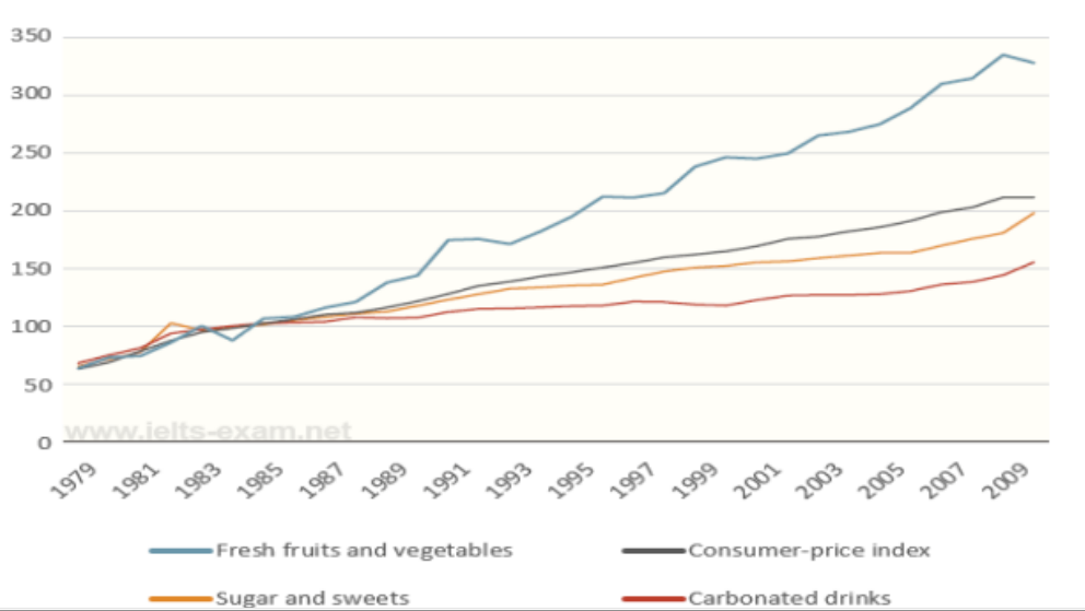
The line graph illustrates a comparison of prices of three product groups in the US from 1978 to 2009.
As can be seen from the graph that prices of three groups of goods and the consumer – price index experienced an upward trend. In particular, the price of fresh fruits and vegetables was higher than CPI during the research period while the price of sugar and sweets and carbonated drinks were consistently below the CPI line.
In a duration of 6 years from 1979 to 1985,there was a little difference in the overall trend in price of all groups with a gradual growth from 70 to 100. After 1985, the consumer – price index rose steadily from around 100 in 1985 to over 200 in 2009. As expected, the price of sugar and sweets and carbonated drinks showed similar trend and gained just under 200 and over 150, respectively, in the end of the period.
One of the most striking features of the graph is that fresh fruits and vegetables witnessed a dramatic soar in the price. After some slight fluctuations, this figure reached the peak of over 330 in 2009.
Top answer
The line graph illustrates a comparison of prices of three product groups in the US from 1978 to 2009. As can be seen from the graph that prices of three groups of goods and the consumer – price index experienced an upward trend. In particular, the price of fresh fruits and vegetables was higher than CPI (That is not true.
- The line graph illustrates a comparison of prices of three product groups in the US from 1978 to 2009.
- As can be seen from the graph that prices of three groups of goods and the consumer – price index experienced an upward trend.
- In particular, the price of fresh fruits and vegetables was higher than CPI (That is not true.
- An individual cannot go to a store and purchase the CPI, but they can purchase fruit and vegetables.
- ) during the research period (You don't know that this was part of some research.
Get the Weekly English Kit 📬
New words, one handy idiom, and a 2-minute quiz — delivered to your inbox to keep your streak alive.
The line graph illustrates a comparison of prices of three product groups in the US from 1978 to 2009.
As can be seen from the graph that prices of three groups of goods and the consumer – price index experienced an upward trend. In particular, the price of fresh fruits and vegetables was higher than CPI (That is not true. An indivi
 Related Questions