
Task 1 in IELTS
Can you score it like in IELTS, please?
The line graph and table compare changes and differences which took place in the average temperatures per month and the average number of hours of sunshine annually in three different major cities.
Overall, it can be clearly seen that Sydney experienced a downward trend in the middle of the year with the most striking feature, being the similar increases between London and New York during the same period of month while total annual hours of sunshine for New York stood at the highest point in comparison with the two remaining groups.
To begin, these two opposing trends between Sydney and the remaining cities were recorded in the average monthly temperatures. Starting at the highest point of over 25, Sydney’s temperature dropped substantially to above 15 in July, before finishing at its original figure. The figure for London and New York were static at a low point in January (around 8 and 5 respectively), continuing to rocket to reach a peak of nearly 30 and 22 correspondingly in July. Thereafter, these numbers fell moderately and overtook that of London before turning to their former levels.
Turning to another main feature, there were differences in the degree of sunshine in hours for three separate cities annually. New York became the largest group with exactly 2,535 hours of sunshine per year, which is more than double that of London, followed by the size of Sydney with around 2,4 thousand hours.
This has a model answer as well in image so can you compare it to mine?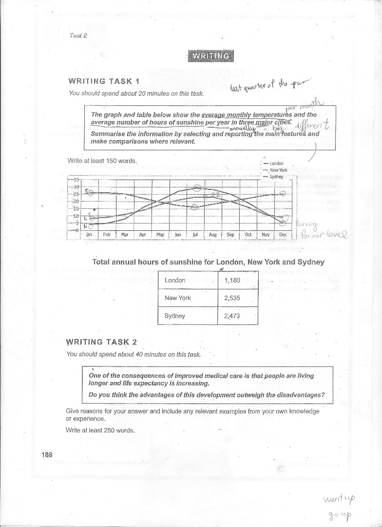
Get the Weekly English Kit 📬
New words, one handy idiom, and a 2-minute quiz — delivered to your inbox to keep your streak alive.
 Related Questions