
Task 1 ielts writing! Pls help
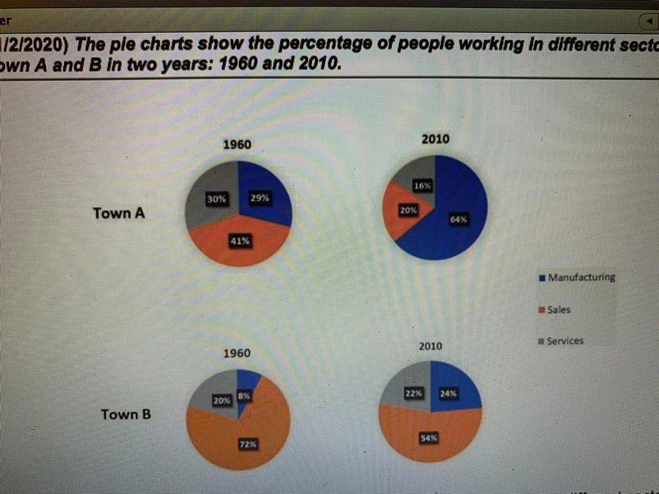
The four pie charts illustrate the proportion of employees in different categories in town A and town B in the 50 year period, starting from 1960.
Overall, the percentage of sales employees in town B was largest in a period given. However, the figures for manufacturing employees in two towns increased significantly throughout the period shown.
The proportion of manufacturing employees in town A accounted for 29% in 1960 then increased sharply to 64% in 2010. The equivalent figures for town B were lower, at 8% and 24% respectively. However, there were rapid decreases in the percentages of sales employees in town A and town B to 20% and 54% respectively.
The percentage of employees in services in 1960 in town A was 30%. The figure in 2010 fell slowly by 14%. The proportion of people working in services in town B experienced an opposite trend. There was a slight increase in services to 22% in 2010.
Top answer
The four pie charts illustrate the proportion of employees in different categories in town A and town B in the 50 year period , starting from 1960. Comments. 1.
- The four pie charts illustrate the proportion of employees in different categories in town A and town B in the 50 year period , starting from 1960.
- Comments.
- 1.
- Illustrate is not a good word choice.
- 2.
Get the Weekly English Kit 📬
New words, one handy idiom, and a 2-minute quiz — delivered to your inbox to keep your streak alive.
The four pie charts illustrate the proportion of employees in different categories in town A and town B in the 50 year period, starting from 1960.
Comments.
1. Illustrate is not a good word choice.
2. It is not clear to the
Overall, the percentage of people in sales jobs employees in town B was largest in both years. in a period given. However, the figures for manufacturin
 Related Questions