
Task 1 for the beginner: Tourists to England who visited four different attractions in Brighton
Hello teacher, I have written a simple essay related to task 1 in the IELTS test. Please help me to check and correct it. Thank you with love.
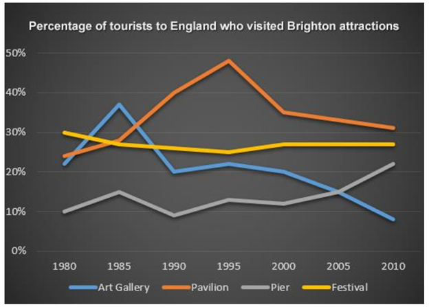
The line graph below shows the percentage of tourists to England who visited four different attractions in Brighton.
Summarise the information by selecting and reporting the main features, and make comparisons where relevant.
Write at least 150 words.
Answer:
The amounts of tourists to England visiting four different attractive places in Brighton over the period from 1980 to 2010 is showed in the line graph. These four attractions were art gallery, pavilion, pier, and festival. The unit of measurement was percentage.
Overall, the percentage of tourists clearly gave two different trends. The first was the increase made by the people who visited pavilion and pier. In contrast, the decrease was the other trend due to the declining in the percentage of the art gallery and festival visitors.
In the initial year, festival showed the highest percentage of exactly 30% compared to the others. Yet over the following years, it slightly decreased with minor fluctuations of plus or minus 5 percent and got around 27% at the end of this period. Despite being in the third place of the four in the first year and having the same trend as festival, art gallery sharply varied in the ten initial years that peaked at slightly above 35% in 1985. After that, it declined over the remainder period and became the least attraction in 2010 with the value of approximately 8%.
On the other hand, pavilion had a steady increase over the 15-year period and hit its peak at around 48% in 1995. In the next 10 years, there was a significant decline in the amount of tourists who traveled in pavilion but it still ranked first in the year 2010. The percentage of people visiting pier was exactly 10% in 1980, then fluctuated over the following 20% before steadily went up to slightly above 22% at the end of this period.
Again, thank you so much.
Top answer
The amounts percentages of tourists to England who visited visiting one or more of four different attractive places in Brighton over the period from 1980 to 2010 is showed shown in the line graph. These four attractions were art gallery, pavilion, pier, and festival. The unit of measurement was percentage.
- The amounts percentages of tourists to England who visited visiting one or more of four different attractive places in Brighton over the period from 1980 to 2010 is showed shown in the line graph.
- These four attractions were art gallery, pavilion, pier, and festival.
- The unit of measurement was percentage.
- Overall, the percentages of tourists to these destinations clearly showed gave two different trends.
- The first was the increase s made by in the people who visited pavilion and pier.
Get the Weekly English Kit 📬
New words, one handy idiom, and a 2-minute quiz — delivered to your inbox to keep your streak alive.
The amounts percentages of tourists to England who visited visiting one or more of four different attractive places in Brighton over the period from 1980 to 2010 is showed
 Related Questions