
Task 1 cambridge 10
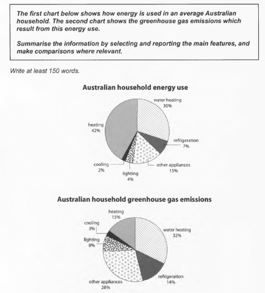
The charts illustrate how energy consumption and the result from them in Australian household.
At first glance it is clear that the percentages in the charts almost changed between the first and the second chart.
According to the charts, the percentage of water heating is not mostly changed (almost a third) but the energy consumption and gas emissions of heating ang other appliances have changed strongly. At heating, its percentage in the energy use chart has the biggest value (about 42 percents) but in other chart its figure is just about 15 percents. About otther appliances, it just use a minority energy but its figure about gas emission is 2 times bigger than about energy consumption.
Furthermore, at cooling, its percentage remain in the charts but the others have changed about between energy consumption and the result from them. About lighting and refrigeration, they just use a little energy but emiting heat and gas alot. More detail, all of their percentages about gas emission is 2 times bigger than their percentage about energy consumption.
In conclusion, comparing two charts, almost of percentages have changed between energy consumption and gas emission.
Top answer
It is clear that you did not understand these charts. They are not the same measures taken at a different time, showing a change in values over time. They are completely different measures taken at the same time.
- It is clear that you did not understand these charts.
- They are not the same measures taken at a different time, showing a change in values over time.
- They are completely different measures taken at the same time.
- The charts illustrate how energy consumption and the result from them in Australian household.
- (The content clause is not grammatical.
Get the Weekly English Kit 📬
New words, one handy idiom, and a 2-minute quiz — delivered to your inbox to keep your streak alive.
It is clear that you did not understand these charts. They are not the same measures taken at a different time, showing a change in values over time. They are completely different measures taken at the same time.
The charts illustrate how energy consumption and the result from them in Australian household. (The cont
Here is a sample of writing for this task.
Tu?n Ð? Hoàng ThiênThe charts illustrate how energy consumption and the result from them in Australian household.
The first chart illustrates the typical use of energy in Australian homes, categorized by the type of usage: heating, water heating, cooling, lighting, refrigeration, and other appliances. The
 Related Questions