
Task 1 bar chart
The bar chart below gives information about the percentage of the population living in urban areas in different parts of the world.
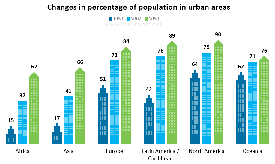
The bar chart compares the growth of the number of people living in urban regions in six nations around the world between 1950 and 2050.
Overall, an upward trend was observed for the percentage of urban citizens in all six countries of the world. North America will remain as the most densely populated country during the period.
In 1950, the proportion of the population in Africa started at the lowest among 6 countries before experiencing a remarkable jump of 37% in over five decades to be expected to reach 62% in 2050. Similarly, the percentage of citizens in cities of Asia, Latin America/ Caribbean almost doubled, whereas, in Europe, it only increased by 21%. Their numbers are forecasted to continuing increasingly, with over half of urban residents in Asia, 84% in Europe, and 89% in Latin America, making the area with the second most dense population.
The number of people living in urban areas in North America and Oceanic shared roughly similar levels in 1950, with above three-fifths of the population residing in urban regions. By 2050, it is projected that the changes will be slower than before, increasing by only 11% and 5% respectively.
Top answer
The bar chart compares the growth of the number of people (That is incorrect. Number of people would be something like 7,342,543 or 13,438,988. ) living in urban regions in six nations (wrong word.
- The bar chart compares the growth of the number of people (That is incorrect.
- Number of people would be something like 7,342,543 or 13,438,988.
- ) living in urban regions in six nations (wrong word.
- Oceania is not a nation, and neither is Caribbean) around the world between 1950 and 2050 .
- ) Overall, an upward trend was observed (incorrect) for the percentage of urban citizens in all six countries of the world.
Get the Weekly English Kit 📬
New words, one handy idiom, and a 2-minute quiz — delivered to your inbox to keep your streak alive.
The bar chart compares the growth of the number of people (That is incorrect. Number of people would be something like 7,342,543 or 13,438,988. There are no numbers on this plot.) living in urban regions in six nations (wrong word. Oceania is not a nation, and neither is Caribbean) arou
This sample essay is much to long, but it will give you some ideas for vocabulary and phases.
Outline:
Paragraph #1. Describe the bar chart: the major groups and the years.
Paragraph #2 Write some main features.
Paragraph #3 Write some details. Combine the areas into those with similar numbers.
The bar chart compares six large regions of the world in terms of t
 Related Questions