
Task 1
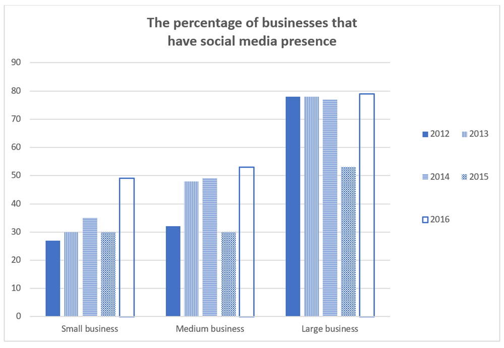
The bar chart shows the percentage of the small, medium, large companies which used social media for business purposes between 2012 to 2016.
The bar chart compares the proportion for three different scales of companies in terms of social media usage for business purposes during the period from 2012 to 2016. The scales are small, medium, and large enterprises.
Overall, the total usages were correlated with the scales, the larger companies, the larger allocation. However, the percentage of the three firm brackets varied over the years.
During the first three years, the large business bracket had a plateau at approximately 80% for social-media networks. In contrast, those in the average and small companies had a significant increase. Starting at the lowest point at 27%, the small business went up steadily roughly 5% per year, reaching 35% in 2014 while the latter ended next two years with a 20% increase in social media use.
By 2015, there was a major decrease in all three enterprises. Half of the expenditure from large companies was used for social media compared to the same percentage of medium and small businesses, both at 30%. However, in the following year, the proportion of companies using social media increased regardless of their size, with the largest companies accounting for 80% as its 2012 point and around 50% for others.
Thank you, teacher.
Top answer
I'm looking forward to seeing your feedback. Please review my task 1 essay. Thank you so much
- I'm looking forward to seeing your feedback.
- Please review my task 1 essay.
- Thank you so much
Get the Weekly English Kit 📬
New words, one handy idiom, and a 2-minute quiz — delivered to your inbox to keep your streak alive.
I'm looking forward to seeing your feedback. Please review my task 1 essay. Thank you so much
 Related Questions