
Summarise the information
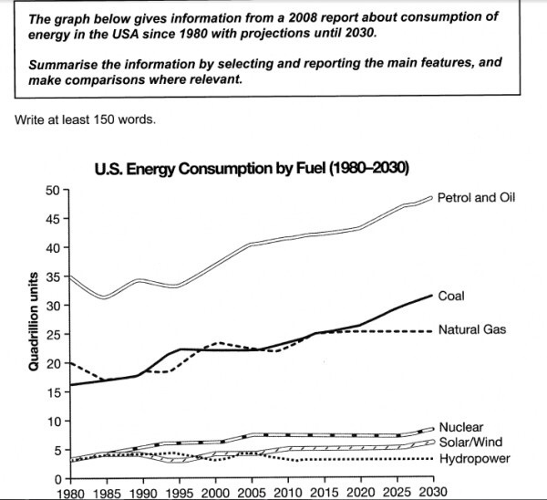
The chart illustrates data on consumption of energy at a 2008 report of USA from 1980 to 2030.
According to the chart, it is evident to see that almost fuels go up between 1980 and 2030.
At the beginning in 1980, the figures of nuclear, solar/wind and hydropower fuels started at the same value (about 4 quadrillion units). Excepting a maintain figures of hydropower, two others grew gradually until 2030.
According to two lines about coal and natural gas, the number of consumption natural gas fluctuated between 1980 and 2015, after that it was not increase or decrease. There was a continue growth in the number of coal in that period.
Moving on to the final line about petrol and oil, the number of fuel varied steadily from 1980 to 1995 but the was a quick soar in its of that period. Moreover, it will peak of the chart with that the figure is approximately 48 quadrillion units in 2030.
Overall, it is calculated that the number of fuels will increase gradually from 1980 to 2030 with that the most consumption is petrol and oil and the less consumption is hydropower.
Top answer
The chart illustrates data on consumption the patterns of US energy consumptio n, in quadrillion s of units of six types of fuel, from 1980 out to 2030 at based on a 2008 repor t. of USA from 1980 to 2030. According to the chart, it is evident to see that almost all six fuels show an upward trend in consumption for the entire period.
- The chart illustrates data on consumption the patterns of US energy consumptio n, in quadrillion s of units of six types of fuel, from 1980 out to 2030 at based on a 2008 repor t.
- of USA from 1980 to 2030.
- According to the chart, it is evident to see that almost all six fuels show an upward trend in consumption for the entire period.
- go up between 1980 and 2030.
- At the beginning in 1980, the figures of for nuclear, solar/wind and hydropower fuels energy consumption started at the same value (about 4 quadrillion units).
Get the Weekly English Kit 📬
New words, one handy idiom, and a 2-minute quiz — delivered to your inbox to keep your streak alive.
The chart illustrates data on consumption the patterns of US energy consumption, in quadrillions of units of six types of fuel,
 Related Questions