
Simple task 1 for the beginner
Hello teacher, I have written a simple essay related to task 1 in the IELTS test. Please help me to check and correct it. Thank you with love.
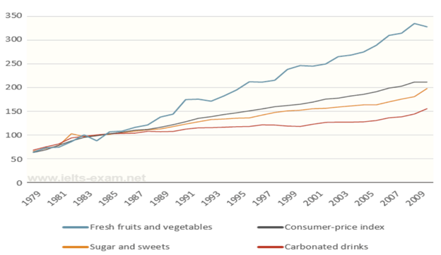
The graph below shows relative price changes for fresh fruits and vegetables, sugars and sweets, and carbonated drinks between 1978 and 2009. Summarise the information by selecting and reporting the main features, and make comparisons where relevant. Write at least 150 words.
Answer:
The line graph gives general information about the changes in price of three different food groups in a 30-year-period, from 1979 to 2009.
Overall, all of the food groups increased at the same starting point in 1979, approximately 60, despite the variation. Standing out of other groups, only the increase in price of fresh fruits and vegetables was significantly higher than the rise in the general consumer-price index. Both of the remained groups were below the index of consumer price.
Over the period, the consumer-price index steadily rose from the starting point to around 210 in the year of 2009. The price for sugar and sweets showed the similar trend and reached exactly 200 in 2009 after fluctuation, which was higher than the value of carbonated drinks at slightly above 150. On the other hand, fresh fruits and vegetables showed the different trend when giving the particularly huge conjunction after 1989 and strongly varied in the remainder period. In the year 2009, the price in this kind of food group archived around 330.
Top answer
The line graph gives general information (That is not good. It does not give general information. It plots very specific values.
- The line graph gives general information (That is not good.
- It does not give general information.
- It plots very specific values.
- ) about the changes in price of three different food groups (What are these groups?
- ) in a 30-year-period, from 1979 to 2009.
Get the Weekly English Kit 📬
New words, one handy idiom, and a 2-minute quiz — delivered to your inbox to keep your streak alive.
The line graph gives general information (That is not good. It does not give general information. It plots very specific values. What is on the graph?) about the changes in price of three different food groups (What are these groups? You forgot to mention the consumer price index, too.)
 Related Questions