
PLS!!!Help me by checking my writing task 1 _ Line graph
The graph below gives information from a 2008 report about consumption of energy in the USA since 1980 with projections until 2030.
Summarize the information by selecting and reporting the main features, and making comparisons where relevant.
My essay:
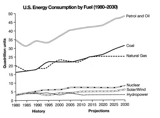
The line graph shows the amount of energy consumption in the USA from 1980 -2008, with projected use until 2030. There are six energy ranges: hydropower, solar/wind, nuclear, natural gas, coal, and petrol and oil.
Overall, solar/wind, nuclear, natural gas, coal, and petrol and oil show an upward trend; while hydropower remains stable.
In 1980, both nuclear, solar/wind, and hydro power were approximately 4 quadrillion. In comparison, natural gas and coal were about 16 quadrillion and 20 quadrillion respectively. Obviously, petrol and oil were consumed 35 quadrillion which were highest energy consumption in 1980. From 1980 and 1995, petrol and oil fluctuated around 35 quadrillion. Between 2000 and 2015, they increased significantly. It is anticipated that petrol and oil will grow by around 48 quadrillion.
Coal and natural gas experienced an upward trend from 1980 to 2015. In 2015, natural gas increased at 25 quadrillion and is predicted to remain stable at 25 quadrillion. Coal is predicted to rise by around 32 quadrillion. Nuclear, and solar/wind power increased gradually. It is anticipated that nuclear power will grow around 8 quadrillion and solar/ wind power will rise by 6 quadrillion. In the same time, hydropower will be 4 quadrillion as in 1980.
Get the Weekly English Kit 📬
New words, one handy idiom, and a 2-minute quiz — delivered to your inbox to keep your streak alive.
 Related Questions