
PLS!! Help me by checking my task 1 _ Towns A and B
Topic: The charts show the percentage of people working in different sectors in Towns A and B in two years, 1960 and 2010.
My task 1:
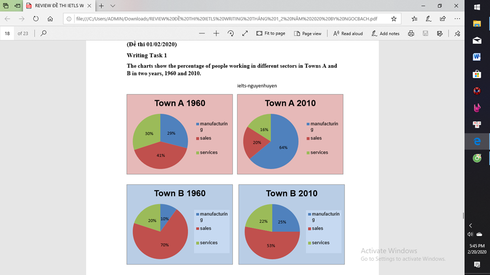
The pie charts illustrate the proportion of the working population in manufacturing, sales and services in Towns A and B in 1960 and 2010.
Overall, the percentage of manufacturing increased in both Towns, while the opposite is true for the proportion of sales.
In 1960, the percentage of manufacturing was 29% in Towns A and was 10% in Towns B. After five decades, manufacturing was the largest segment in Towns A, with 64%. In Towns B, it accounted for 25% which increased by 15% in 2010.
In contrast, the percentage of sales decreased by 21% in Towns A and by 17% in Towns B. In 2010, the sales figure was recorded, with 20% and 53% in Towns B.
Fewer people working in services in Towns A, whose figure fell to 16% in 2010. In contrast, the percentage of people in Towns B working in services was 30% in 1960 and slightly rose to 22% in 2010.
Top answer
The pie charts illustrate the proportion of the people working population in manufacturing, sales and services in Towns A and B in 1960 and 2010. Overall, the percentage of workers employed in manufacturing increased in both t owns, while the opposite is true for the proportion of those working in sales. In 1960, the percentage of for manufacturing was 29% in Towns Town A and was 10% in Towns Town B.
- The pie charts illustrate the proportion of the people working population in manufacturing, sales and services in Towns A and B in 1960 and 2010.
- Overall, the percentage of workers employed in manufacturing increased in both t owns, while the opposite is true for the proportion of those working in sales.
- In 1960, the percentage of for manufacturing was 29% in Towns Town A and was 10% in Towns Town B.
- After five decades, the percentage of people working in the manufacturing industry was the largest segment in Towns Town A, with at 64%.
- In Towns Town B, it accounted for the initial figure was 25 %, which increased by 15% in 2010.
Get the Weekly English Kit 📬
New words, one handy idiom, and a 2-minute quiz — delivered to your inbox to keep your streak alive.
The pie charts illustrate the proportion of the people working population in manufacturing, sales and services in Towns A and B in 1960 and 2010.
Overall, the percentage of workers employed in manufacturing increased in both towns,
 Related Questions