
Pls!! Checking my writing task 1_ Thanks a lot
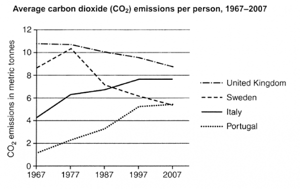
The graph below shows the average carbon dioxide (CO2) emissions per person in the United Kingdom, Sweden, Italy and Portugal between 1967 and 2007.
Summarise the information by selecting and reporting the main features, and make comparisons where relevant.
My essay:
The line chart illustrates the average amount that carbon dioxide emissions per person in four countries, namely United Kingdom, Sweden, Italy and Portugal from 1967 to 2007.
Overall, the amount of cardon dioxide emissions in Italy and Portugal have an upward trend, while other in Sweden and the UK have a downward trend.
United Kingdom had the highest amount of carbon dioxide emissions from 1967 to 2007. In 1967, the highest figure was recorded in the UK, with approximately 11 tonnes. In the same time, the lowest figure was recorded in Portugal, with 1 tonnes per head. From 1967 to 2007, the average amout of carbon dioxide emissions in the UK decreased at 9 tonnes. In contrast, it increased gradually in Portugal by 4 tonnes.
In Italy, the amount of carbon dioxide emissions was recorded in 1967, approximately 4 tonnes, while in Sweden, carbon dioxide emissions was higher than in Italy, at 9 tonnes. Between 1967 and 2007, the average amount of carbon dioxide in Sweden decreased gradually by 3 tonnes. In contrast, this emissions in Italy went up dramatically, at 7 tonnes in 2007.
Top answer
The line chart (wrong word. ) illustrates (wrong word. Use "illustrate" for pictures like maps and process flow diagrams.
- The line chart (wrong word.
- ) illustrates (wrong word.
- Use "illustrate" for pictures like maps and process flow diagrams.
- ) the average amount that carbon dioxide emissions per person in four countries, namely the United Kingdom, Sweden, Italy and Portugal from 1967 to 2007.
- ) dioxide emissions in Italy and Portugal have an upward trend, while other in Sweden and the UK have a downward trend.
Get the Weekly English Kit 📬
New words, one handy idiom, and a 2-minute quiz — delivered to your inbox to keep your streak alive.
The line chart (wrong word. Learn the names of the different types of charts and graphs..) illustrates (wrong word. Use "illustrate" for pictures like maps and process flow diagrams. It is not the correct word for a chart or graph.) the average amount that carbon dioxide emissions per pe
 Related Questions