
PLS CHECK MY SELF-STUDY IELTS WRITTING TASK 1 ! GIVE OPINION AND CORRECT IF TEACHER CAN!! TKS
The line graph describe the change of population in three states of US (Columbia, Yamhill, Washington) in 60 years from 1940 to 2000. Units are measured in thousands.
Overall, we can observed clearly that, population in Washington was the highest compared to two remaining states. This trend continued to grow dramatically to final years. While Columbia and Yamhill had the same patterns of growth, they increased slowly over the given period.
With regarded to population of Washington, in the frist year it started about 75 thounsands of people and rose quickly to approximately 120 thousands in 1970. Surprisingly, this upward trend continued to peak dramatically to by over 240 thousands in final year.
On the other hand, population of Yamhill was just higher columbia slightly but two countries had the same patterns of population growth. From 1940 to 1970 the population of Yamhill and Columbia experienced an slightly increase just about 30 thousand to 45 thousands of people. Likewise, from 1970 to final year population rate of Yamhill increased steadily to 90.000 of people in 2000 while this figure of Columbia was 60 thousands of people in the last year.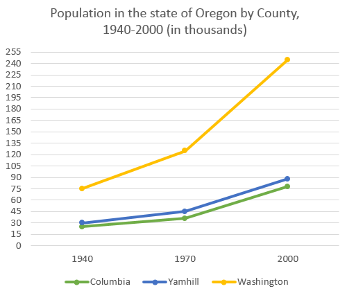 PLS CHECK MY SELF-STUDY IELTS WRITTING TASK 1 ! GIVE OPINION AND CORRECT IF TEACHER CAN!! TKS
Top answer
You have many errors. These are highlighted with comments. The line graph describe (wrong word, wrong form) gives the change of (incorrect.
- You have many errors.
- These are highlighted with comments.
- The line graph describe (wrong word, wrong form) gives the change of (incorrect.
- The actual population numbers are plotted, not the changes in population) population in three states ( 1.
- Wrong word.
Get the Weekly English Kit 📬
New words, one handy idiom, and a 2-minute quiz — delivered to your inbox to keep your streak alive.
You have many errors. These are highlighted with comments.
The line graph describe (wrong word, wrong form) gives the change of (incorrect. The actual population numbers are plotted, not the changes in populat
 Related Questions