
PLS!! Check My IELTS Task 1 _ THANKS
Topic: 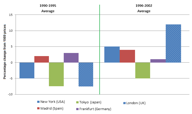
The chart below shows information about changes in average house prices in five different cities between 1990 and 2002 compared with the average house prices in 1989.
My task 1:
The bar chart illustrates the figure for the average house prices in five cities, namely New York, Madrid, Tokyo, Frankfurt and London from 1990 to 2002, a period 12 years compared with 1989.
Overall, between 1990 and 2002, the average house prices in five cities had significant increase. In comparation with the house prices from 1990 to 1995, the percentage between 1996 and 2002 was higher.
Over the 5 years after 1989, the cost of house in Frankfurt (Germany) was the highest house prices, which stood at approximately 3%, followed by Madrid, New York, Tokyo and London. The figure for Tokyo (Japan) and London (UK) were the lowest house prices in five cities, at about -7%.
From 1996 to 2002 average, the cost of house in Tokyo, New York, Mardrid and London increased by around 2%, 10%, 3%, 19% respectively, while Frankfurt showed a downward trend, which decreased slightly by 1%.
Top answer
The bar chart illustrates the figure (A figure is a diagram, table or chart inserted into the text of a technical article. What "figure" are you talking about? "Illustrate the figure" might mean to apply some coloring or annotation to a diagram.
- The bar chart illustrates the figure (A figure is a diagram, table or chart inserted into the text of a technical article.
- What "figure" are you talking about?
- "Illustrate the figure" might mean to apply some coloring or annotation to a diagram.
- It makes no sense as you have used it.
- ) for the average house prices (Incorrect.
Get the Weekly English Kit 📬
New words, one handy idiom, and a 2-minute quiz — delivered to your inbox to keep your streak alive.
The bar chart illustrates the figure (A figure is a diagram, table or chart inserted into the text of a technical article. What "figure" are you talking about? "Illustrate the figure" might mean to apply some coloring or annotation to a diagram. It makes no sense as you have used it. ) for the average
 Related Questions