
Pleaseee help me to correct my task 1 essay. Thanks much!!!
My essay:
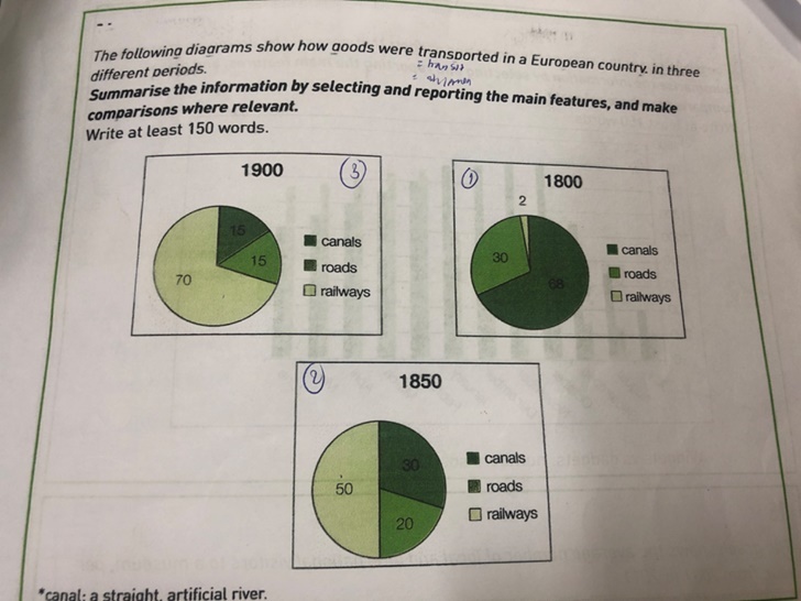
The pie charts compare the proportion of three types of goods transportation in a European nation in three years 1800, 1850 and 1900.
Overall, there was a downward trend in using roads and canals to transport products. On the contrary, railway transit witnesed a surge in popularity and usage.
In 1800, 68% of the country’s goods was transported by canals, followed by 30% of that by roads. Contrastingly, a relatively smaller proportion (2%) was the amount of products shipped by railways, becoming the smallest figure in the time surveyed.
However, in two fifty-year intervals, there was a dramatic a change in terms of railway and canal shipments. Despite being the most used transit system in 1800, the percentage of canal transportation halved by each period, as from 68% to 30% between 1800 and 1850, 30% to 15% in the second period. In contrast, merchandise shipped by railways saw an upsurge, which constituted 50% in 1850 and dominantly presented 70% in 1900. Meanwhile, people in that European country continued to use roads, but gradually less, to transit goods. That figure accounted for a totally 15% in 1900.
WRITE DESCRIPTION HERE
Top answer
The three pie charts compare the proportion of three types of goods transportation in a European nation in three years 1800, 1850 and 1900. (So what are these three types? Your description is not complete.
- The three pie charts compare the proportion of three types of goods transportation in a European nation in three years 1800, 1850 and 1900.
- (So what are these three types?
- Your description is not complete.
- Suggestion: The three pie charts, labeled 1800, 1850 and 1900, show the change in the methods used to convey goods in one European country.
- ) ) Overall, there was a decline downward trend in using roads and canals to transport products.
Get the Weekly English Kit 📬
New words, one handy idiom, and a 2-minute quiz — delivered to your inbox to keep your streak alive.
The three pie charts compare the proportion of three types of goods transportation in a European nation in three years 1800, 1850 and 1900. (So what are these three types? Your description is not complete.
Suggestion:
The three pie charts, labeled 1800, 1850 and 1900, show the change in the methods used to convey goods in
 Related Questions