
Please review the Task 1 writing
Hi
Could you review this writing, please?
The chart below shows the proportions of graduates from Brighton University in 2019 entering different employment sectors.
Summarize the information by selecting and reporting the main features, and make comparisons where relevant.
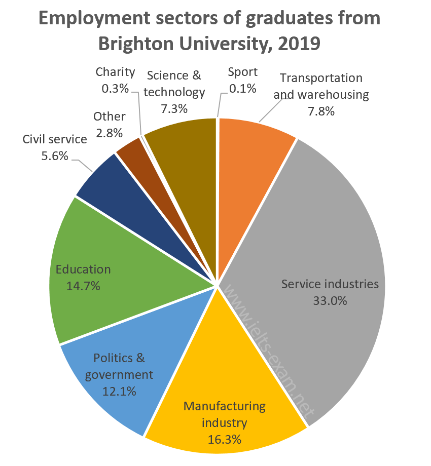
The pie chart shows the employment sectors chosen by the graduates of Brighton University in 2019. Nearly ninety-seven per cent of the graduates have entered various sectors ranging from service industry to civil services. The chart does not contain information about the sectors chosen by the remaining three per cent.
A significant per cent of the graduates have entered service industries, and close to sixteen per cent of them have opted for manufacturing industries. While around fifteen per cent of the graduates have selected Education, twelve per cent have entered politics and government sectors.
Science and Technology and Civil Services have not had many takers: while less than eight per cent has selected the former, only six per cent of them have entered the latter. Sports and Charity have been the least sought after sectors as less than one per cent of the graduates have chosen each of them.
Top answer
The pie chart shows the employment sectors chosen by the graduates of Brighton University in 2019. Specifically, it gives the percentage of graduates who chose each of nine categories, ranging from services to charities. ) Nearly ninety-seven per cent of the graduates have entered various sectors ranging from service industry to civil services.
- The pie chart shows the employment sectors chosen by the graduates of Brighton University in 2019.
- Specifically, it gives the percentage of graduates who chose each of nine categories, ranging from services to charities.
- ) Nearly ninety-seven per cent of the graduates have entered various sectors ranging from service industry to civil services.
- The chart does not contain information about the sectors chosen by the remaining three per cent.
- ) Overall, nearly half of the graduates chose to work in the top two sectors, services and manufacturing.
Get the Weekly English Kit 📬
New words, one handy idiom, and a 2-minute quiz — delivered to your inbox to keep your streak alive.
The pie chart shows the employment sectors chosen by the graduates of Brighton University in 2019. Specifically, it gives the percentage of graduates who chose each of nine categories, ranging from services to charities. (Begin a new paragraph when you change the topic from describing the figure to identifying main features.) Nearly ninety-s
 Related Questions