
Please review my writing. Thank you
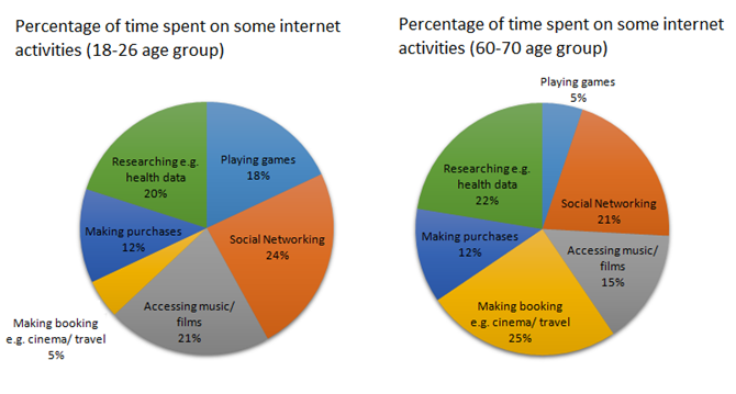
The charts below show the percentage of time younger and older people spend on various Internet activities in their free time (excluding email).
The two pie charts compare the proportion of leisure time on six different digital activities for young and old generations. They are shown to play games, research health data, social networking, access films/ music, and book and purchase.
In general, there were most significantly different preferences of internet activities from both age groups.
Social networking was the most popular activity in young people’s free time, accounting for nearly a quarter of the total time compared to a little above 20% for the elder. However, seniors spare most of their leisure time on making a reservation to cinema/ travel, at 25%, which was fivefold as much as the time the younger age group constitutes, at 5%. Regarding music or film access hours, the young use 6% higher than the opposite counterparts (21% versus 15%). Similarly, playing games constitute roughly one-fifth of the young’s time, whereas a minority of elder spend their time on this stuff. By contrast, old people preferred researching health data, at 22%, while young people spend slightly lower, at 20%. When it comes to purchases, there was a similar portion in both groups, at 12%.
Top answer
The two pie charts compare the proportion of leisure time (It is not leisure time in general, but time online, except for emailing) on six different digital activities for young and old generations. They are shown to play games, research health data, social networking, access films/ music, and book and purchase . You need to be very accurate in describing the infographics.
- The two pie charts compare the proportion of leisure time (It is not leisure time in general, but time online, except for emailing) on six different digital activities for young and old generations.
- They are shown to play games, research health data, social networking, access films/ music, and book and purchase .
- You need to be very accurate in describing the infographics.
- The two pie charts, one for young people (18-26) and the other for older people (60-70), break down the amounts of time they spend on the internet by activity.
- The total excludes answering emails, and has six activities: gaming, researching, purchasing, booking reservations, playing music or videos and social networking.
Get the Weekly English Kit 📬
New words, one handy idiom, and a 2-minute quiz — delivered to your inbox to keep your streak alive.
The two pie charts compare the proportion of leisure time (It is not leisure time in general, but time online, except for emailing) on six different digital activities for young and old generations. They are shown to play games, research health data, social networking, access films/
 Related Questions