
Please review my writing task 1. Thank for your helping.
WRITE DESCRIPTION HERE
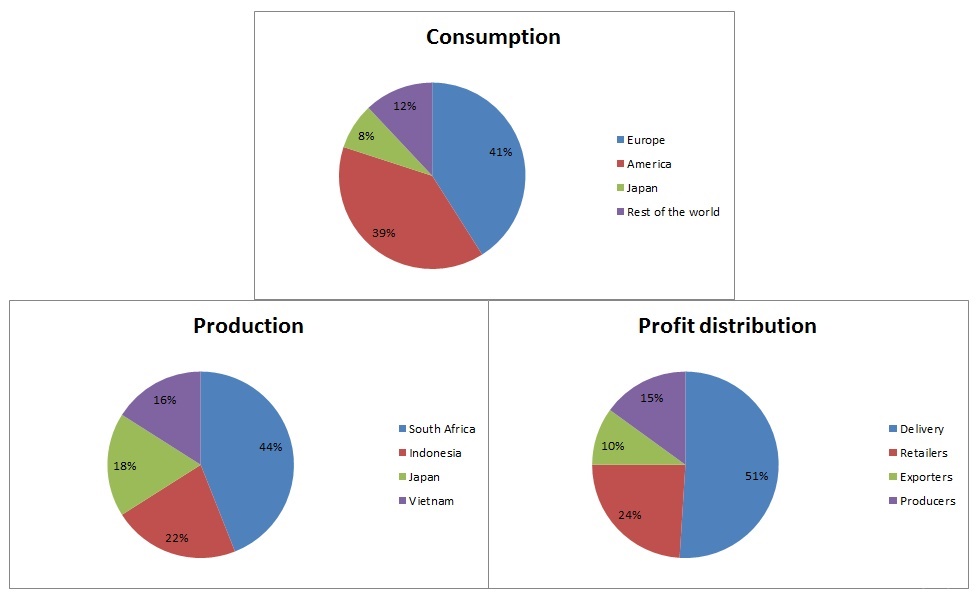
The pie charts give the information about the percentage of coffee manufactured, used and the profit allocated from different sources of coffee.
Overall, it can be seen from the charts that the proportion of European people consuming coffee is the highest, as compared to that of Japanese is the lowest. The amount of coffee produced the most is in South Africa and the least in Viet Nam. The main profit source of coffee results from delivery.
As mentioned above, the percentage of coffee used in Europe is the highest, accounting for 41%. The proportion of American consuming coffee is higher than that of other countries, with 39% for the former and 12% for the later. Besides, the figure for Japan is the lowest with 8%.
On the other hand, the percentage of coffee made in South Africa takes the first position among countries producing coffee, taking up nearly a half. By contrast, Viet Nam is the country that accounts for the lowest percentage of producing coffee with 16%. Moreover, the delivery accounts for above a half for distributing the profit from coffee, with the highest percentage in the chart. In comparison with the proportion of profit distribution from exporters is the least one with only 10%.
Top answer
See the answer in the following link.
- See the answer in the following link.
Get the Weekly English Kit 📬
New words, one handy idiom, and a 2-minute quiz — delivered to your inbox to keep your streak alive.
 Related Questions