
Please review my writing task 1.
The line graph shows TV news viewing figures over a one-year period. Write a report of at least 150 words summarizing the main features and making comparisons where relevant.
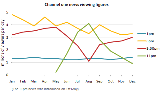
The line chart indicates the changes in the number of people watching TV news over a period of 12 months. The news is shown at 1pm, 6pm, 9:30pm and 11pm.
The most noticeable observation is that the 6pm news was by far the most viewers, while the least people who watched the news was at 1pm.
At the beginning of the year, most people spent time watching TV news at 6pm, about approximately 4.9 million viewers, while the 9.30pm news received views lower, just around two thirds of the viewers at 6pm. Over the following 12 months, the number of viewers fluctuated with an overall downward trend and reached a low around 3.2 million views, while people watching news saw a slight increase in May and then hit a low to 1 million in August and climbed again to 3 million.
A new news at 11pm emerged on 1st May and there was a considerably rise and reached its peak around 4 million views and then dropped sharply to 1 million viewers at the end of the year. Finally, the 1pm news remained relatively stable during the period shown about 1.3 million viewers per day.
Top answer
The line chart indicates the changes in the number of people watching TV news on a particular station (Channel One) over a period of 12 months. The news is shown at 1pm, 6pm, 9:30pm and 11pm. The most noticeable observation is that the 6pm news was attracted by far the most viewers, while the least number of people who watched the news was at 1pm.
- The line chart indicates the changes in the number of people watching TV news on a particular station (Channel One) over a period of 12 months.
- The news is shown at 1pm, 6pm, 9:30pm and 11pm.
- The most noticeable observation is that the 6pm news was attracted by far the most viewers, while the least number of people who watched the news was at 1pm.
- 30pm news received views lower, had just around two thirds that number.
- of the viewers at 6pm.
Get the Weekly English Kit 📬
New words, one handy idiom, and a 2-minute quiz — delivered to your inbox to keep your streak alive.
The line chart indicates the changes in the number of people watching TV news on a particular station (Channel One) over a period of 12 months. The news is shown at 1pm, 6pm, 9:30pm and 11pm.
The most noticeable observation is that the 6pm news was attracted by far the most viewers, w
 Related Questions