
Please review my writing task 1.
The three pie charts below show the coffee production and consumption around the world, and also the profit distribution. Summarize the information by selecting and reporting the main features and make comparisions where relevant.
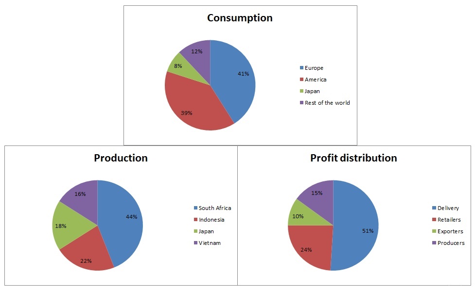
The three pie charts give information about the production and consumption of coffee as well as the proportion of profits are distributed around the world.
Overall, the highest production of coffee comes from South Africa, while Europe is by far the most largest consumption of coffee. Notably, the distribution of profits from delivery sector is the greatest proportion of the four categories.
Regarding to the production, approximately a half of coffee produced is recorded in South Africa. The three other countries: Indonesia, Japan and Vietnam are much lower, with percentages ranging from 16% to 22%. By contrast, the vast majority of coffee is consumed in Europe, at 41%, closely followed by America, at 39%. Japan and the world as a whole account for about 20% of the total.
Turning to the profits distribution, more than a half amount of profit of the coffee is distributed from delivery resources, 51%. The figures for retailers and producers are about 24% and 15% respectively, and the lowest profit distribution goes for exporters, at 10%.
Top answer
The three pie charts give information about (That is vague and non-specific. Exactly what is on these charts? ) the production and consumption of coffee as well as the proportion of profits are distributed around the world.
- The three pie charts give information about (That is vague and non-specific.
- Exactly what is on these charts?
- ) the production and consumption of coffee as well as the proportion of profits are distributed around the world.
- (That is ungrammatical.
- You cannot use a main clause that way.
Get the Weekly English Kit 📬
New words, one handy idiom, and a 2-minute quiz — delivered to your inbox to keep your streak alive.
The three pie charts give information about (That is vague and non-specific. Exactly what is on these charts? ) the production and consumption of coffee as well as the proportion of profits are distributed around the world.
(That is ungrammatical. You cannot use a main clause that way.
 Related Questions