
Please review my writing task 1
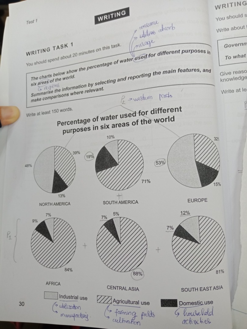
The pie charts indicates the proportion of water consumed for disparate purpose in six countries around the world.
It is clear that there were significant changes in water consumtion through all 6 areas shown on the graph. While industry account for the most water in North American and Europe, the amount of water used for agriculture is the highest percentage in eastern parts.
As can be seen, Central Asia uses water for farming field at almost 90. These figure is below 85% in Africa and South East Asia. The biggest percent of domestic water absorb could be observed is in South America, at 19% while Asian countries have equal proportion, at 7%. The amount of water consumed for manufacturing is larger than those used in Africa and Cetral Asia.
On the other hand, a half of water is required in industrial sectors in western parts. In both of these continents, water cultivation represented the second highest proportion,at nearly a third percent. Finally, Europe and North America spend only half as much in household activities ( 15% and 13%) as agricultural use ( about 32% and 39% respectively)
WRITE DESCRIPTION HERE
Top answer
) around the world. Example opening paragraph. The pie charts compare the relative amounts of water used in three different economic sectors (Industry, Agriculture and Domestic use) among six regions of the world, four continents (Europe, Africa, North and South America) and two large areas of Asia (Central and South East).
- ) around the world.
- Example opening paragraph.
- The pie charts compare the relative amounts of water used in three different economic sectors (Industry, Agriculture and Domestic use) among six regions of the world, four continents (Europe, Africa, North and South America) and two large areas of Asia (Central and South East).
- Read this paragraph without looking at the figure.
- You can imagine exactly what it looks like.
Get the Weekly English Kit 📬
New words, one handy idiom, and a 2-minute quiz — delivered to your inbox to keep your streak alive.
The pie charts indicates (wrong word, wrong form) the proportion of water consumed for disparate purpose (wrong form, also imprecise - what are the purposes, and how many?) in six countries (wrong word - Europe is not a country.) arou
 Related Questions