
Please review my writing task 1.
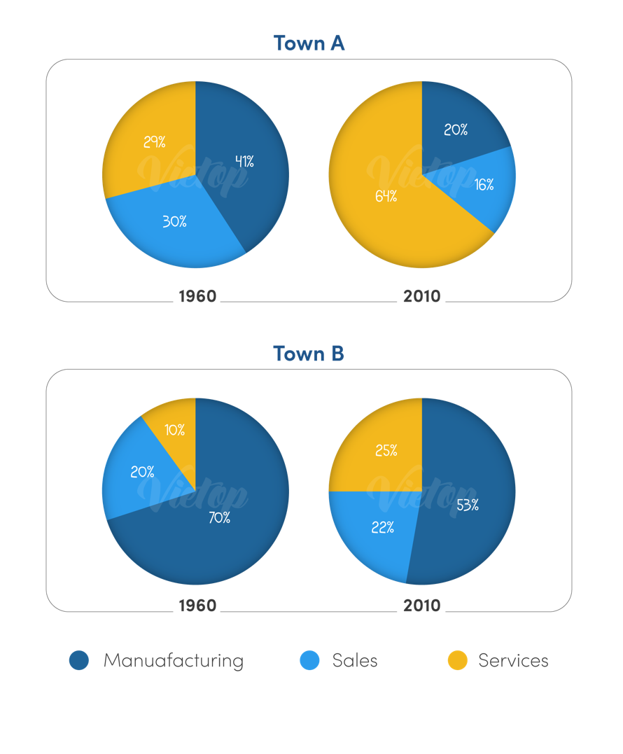
The charts below show the percentage of people working in different sectors in town A and town B in 1960, 2010.
The pie charts compare the proportion of people working in three sectors (manuafacturing, sales and services) in town A and B in two different years (1960 and 2010).
Overal, in town A the period from 1960 to 2010 saw the greatest increase in the ratio of workers in the services sector, which overtook the other sectors as the primary employment of the town. However, the number of people working in manuafacturing sector had the highest proportion in town B.
In town A, around 41% of the people was employed in manuafacturing sector in 1960, while the figures for sales and services were slightly lower, about 30% and 29% respectively. However, in 2010 services surpassed sales and manuafacturing to reach the highest proportion of employees, whereas there was a gradual decline in the numbers of people working in sales and manuafacturing, around 16% and 20% respectively.
Turning to in town B, from 1960 to 2010, although there was a slight decrease in manuafacturing from around 70% to about 53%, this sector also took up the vast majority of workers. By contrast, services and sales was a growth in the percentage of people working by 15% and 2% respectively.
Top answer
The pie charts compare the proportio n s of people working in three sectors [ 1] (man uf acturing, sales and services) in tow n s A and B in two different years (1960 and 2010). Overa l l in town A, the period from 1960 to 2010 saw the greatest increase in the ratio of workers in the services sector, which overtook the other sectors as the [ 2] primary employment of the town. However, despite a modest fall, the number of people working in [ 3] the man uf acturing sector had represented the highest proportion in town B in both years .
- The pie charts compare the proportio n s of people working in three sectors [ 1] (man uf acturing, sales and services) in tow n s A and B in two different years (1960 and 2010).
- Overa l l in town A, the period from 1960 to 2010 saw the greatest increase in the ratio of workers in the services sector, which overtook the other sectors as the [ 2] primary employment of the town.
- However, despite a modest fall, the number of people working in [ 3] the man uf acturing sector had represented the highest proportion in town B in both years .
- In town A, around 41% of the people was were employed in [ 3] man uf acturing sector in 1960, while the figures for sales and services were slightly lower, about 30% and 29% respectively.
- However, in 201 0, services surpassed sales and man uf acturing to reach become the highes t, proportion of employees, whereas there was a gradual [ 4] small decline in the numbers of people working in sales and man uf acturing, to around 16% and 20% respectively.
Get the Weekly English Kit 📬
New words, one handy idiom, and a 2-minute quiz — delivered to your inbox to keep your streak alive.
The pie charts compare the proportions of people working in three sectors [ 1] (manufacturing, sales and services) in towns A and B in two different years (1960 and 2010).
Lê Th? Thanh Trúc increase in the ratio of workers in the services sector,
Ratio is incorrect. A ratio compares the relative numbers of two quantities: For example the ratio of manufacturing to service workers in Town B in 1960 was 7:1, and approximately 2:1 in 2010.
A ratio is expressed with a co
Can you give me some paraphrases with " people working" ?
 Related Questions