
Please review my Writing Task 1
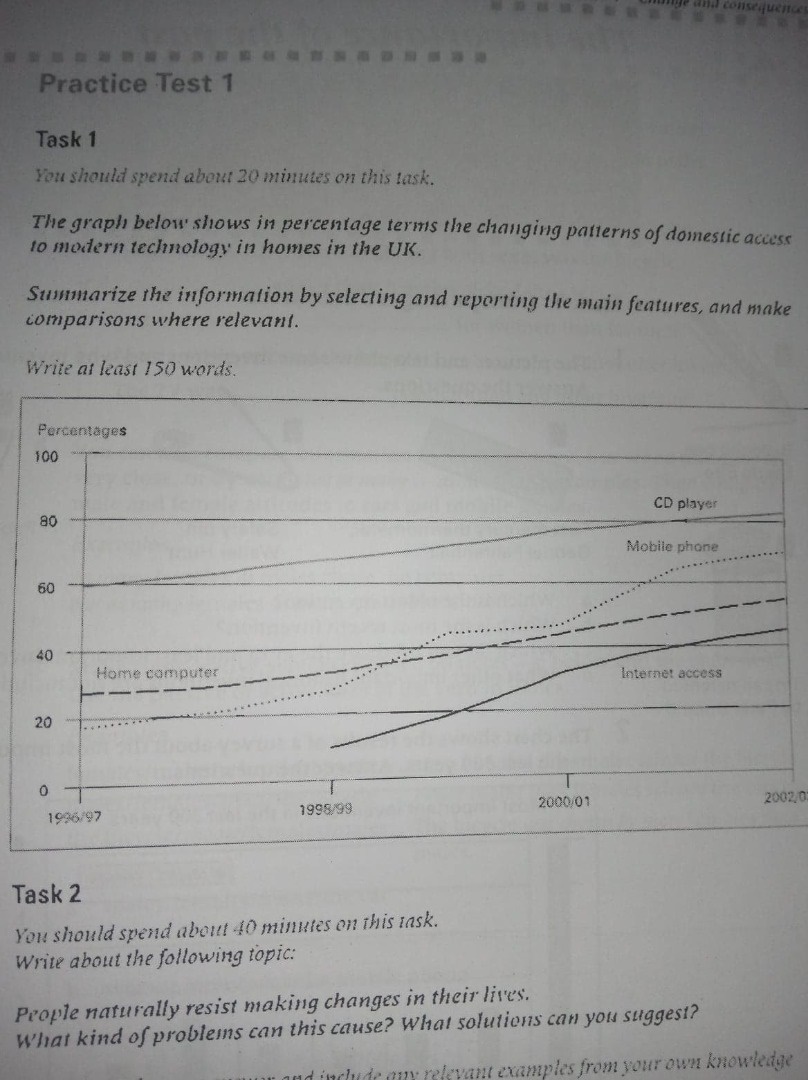
The graph below provides information about the percentage of the changing patterns of domestic access to modern technology in homes in UK.
Obviously, there was only a trend from 1996 to 2003, it was the increase at all aspects. Furthermore, the percentage of mobile phone increased slowly from 1999 to 2000.
CD player had the highest percent from 1996 to 2003, the lowest one belonged to Internet access, the percentage of CD player was always higher than 60, while the percentage of Internet access was under 50. The percentage of home computer increased gradually from 1996 to 2003, from approximately 30 percent to nearly 60 percent. The percentage of mobile phone climbed sharply from 1996 to 1999 but rose gradually from 1999 to 2000, after that, it climbed sharply and then rose gradually, up to 70 percent
It is noticable that the percentage of mobile phone was not stable from 1996 to 2003. Otherwise, there were a stable increase at the rest patterns of domestic access to modern technology.
Please give me any mistakes on my post, and if possible, please give me the score for this post
Thank you so much
Top answer
Please read my advice for Task 1 essays. ) graph below (Do not use "above, below, provided or given") provides information about (That is very vague. You are supposed to describe the graphic precisely.
- Please read my advice for Task 1 essays.
- ) graph below (Do not use "above, below, provided or given") provides information about (That is very vague.
- You are supposed to describe the graphic precisely.
- ) the percentage of the changing patterns (What is a percentage of a changing pattern?
- I have no idea what this might be.
Get the Weekly English Kit 📬
New words, one handy idiom, and a 2-minute quiz — delivered to your inbox to keep your streak alive.
 Related Questions