
Please review my writing ielts task 1
The graph below shows the proportions of four different materials that were recycled from 1982 to 2010 in a particular country.
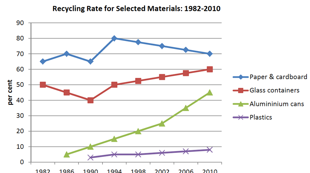
The line graph compares the recycling percentages of four materials in a particular nation between 1982 and 2010.
It can be seen that all figures experienced a significant increase except for paper and cardboard. In addition, despite a remarkable decrease, the recycling percentage of paper and cardboard was highest in contrast to that of plastics which was the lowest figure shown in the graph.
Turning to the detail, between 1982 and 1990, the proportion of glass containers that were recycled dropped slightly from 50% to a bottom of 40%, and then rose dramatically to 60% in 2010, finishing the period at 2nd place. While there was a steady growth in the recycling percentage of alumininium cans by about 40% from around 5% in 1986, the figure for plastics went up more slowly from just over 1% in 1990 to about 9% at the end of the period.
From 1982 to 1994, the recycling proportion of paper and cardboard fluctuated and rose from about 65% to a peak of 80%. After that, it declined moderately to 70% in 2010.
Top answer
The line graph compares the recycling percentages of four materials in a particular nation between 1982 and 2010. (What are these materials? ) It can be seen that (That clause is useless.
- The line graph compares the recycling percentages of four materials in a particular nation between 1982 and 2010.
- (What are these materials?
- ) It can be seen that (That clause is useless.
- ) all figures experienced (Both words are wrong.
- ) a significant increase except for paper and cardboard.
Get the Weekly English Kit 📬
New words, one handy idiom, and a 2-minute quiz — delivered to your inbox to keep your streak alive.
The line graph compares the recycling percentages of four materials in a particular nation between 1982 and 2010. (What are these materials? You need to put that in the opening paragraph for coherence and cohesion.)
It can be seen that (That clause is useless. It has not information content.) all figures experienced
 Related Questions