
Please review my writing ielts task 1
The chart below gives information about global population percentages and distribution of wealth by region.
Summarise the information by selecting and reporting the main features, and make comparisons where relevant.
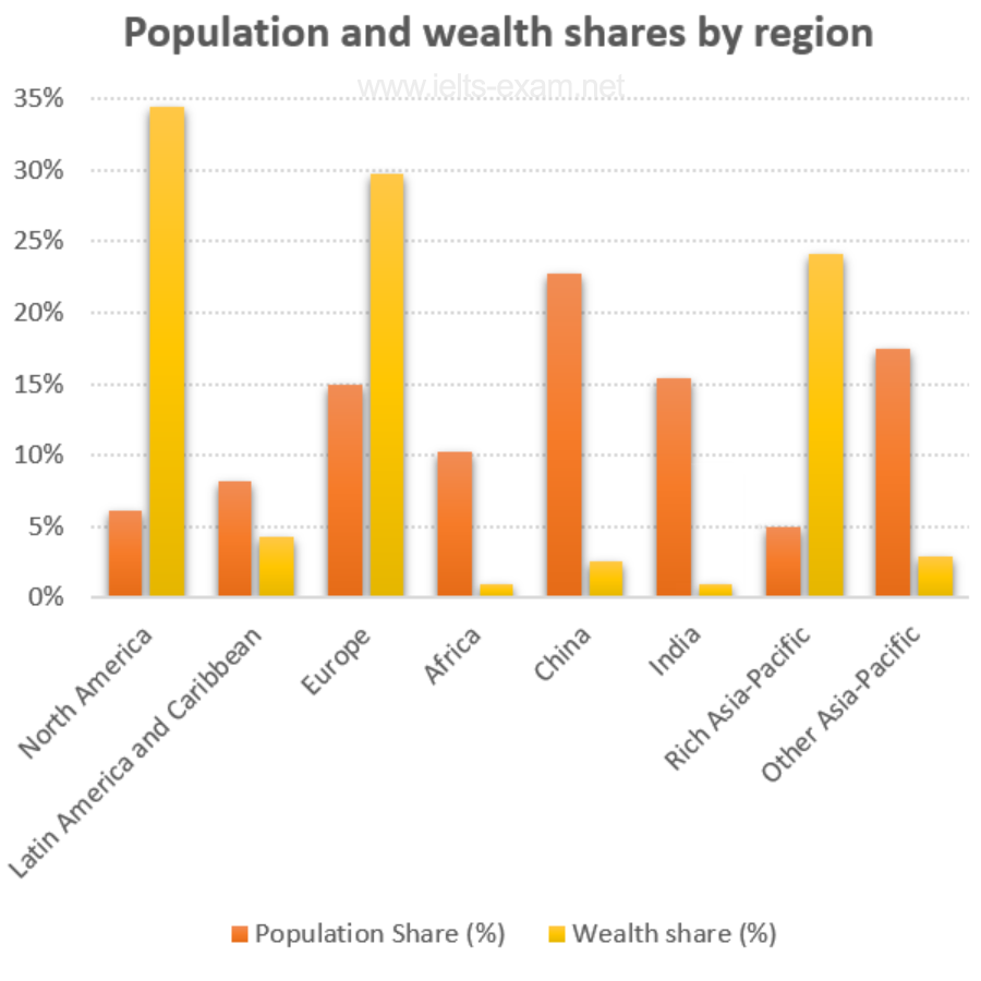
The bar chart compares the proportion of the world's population and wealth share by eight different regions.
Overall, China accounts for the highest percentage of the global population, while wealth share in Rich Asia-Pacific is the lowest of the eight regions.
Looking at the chart in more detail, North America has just over 5% of the world's population, 30% lower than its proportion of wealth share. The same pattern can be seen in Europe where the figure for wealth share is double that for population share, at 30% and 15%, respectively, and in Rich Asia-Pacific, with approximately 24% of wealth share but only 5% of the global population.
In contrast, the overall share of wealth owned by people in Africa, China, India, Latin America and Caribbean and other lower-income countries in Asia is much lower than their population share. China has the highest percentage of the global population, at 24%, but only roughly 2,5% of wealth share. The most striking pattern is in Africa and India where only 1% of wealth share is owned by 10% and 15% of the global population, respectively.
Top answer
The bar chart compares the proportion of the world's population and wealth share for by eight different regions. (What are these regions? ) Overall, China accounts for the highest percentage of the global population, while wealth share in Rich Asia-Pacific is the lowest of the eight regions.
- The bar chart compares the proportion of the world's population and wealth share for by eight different regions.
- (What are these regions?
- ) Overall, China accounts for the highest percentage of the global population, while wealth share in Rich Asia-Pacific is the lowest of the eight regions.
- ) In detail, North America has just over 5% of the world's population, 30% lower than its proportion of wealth share.
- The same pattern can be seen in Europe where the figure (wrong word) for wealth share is double that for population share, at 30% and 15%, respectively, and in Rich Asia-Pacific, with approximately 24% of wealth share but only 5% of the global population.
Get the Weekly English Kit 📬
New words, one handy idiom, and a 2-minute quiz — delivered to your inbox to keep your streak alive.
The bar chart compares the proportion of the world's population and wealth share for by eight different regions. (What are these regions? )
Overall, China accounts for the highest percentage of the global population, while wealth share in Rich Asia-Pacific is the lowest of the eight regions.
Looking at the
Sample Essay:
Note: This essay is quite challenging, because to get the highest mark, you need to make relative comparisons of wealth across the regions.
The clearest description of the information for comparison purposes is in terms of ratios. If the world's wealth were equally distributed, the ratio of share of population to share of wealth would be 1:1. That is, a region with 5
 Related Questions