
Please review my writing ielts task 1
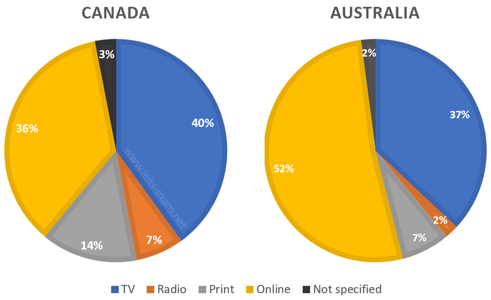
The pie charts provide data about five ways of getting the news in two different countries, Canada and Australia.
Overall, watching TV is the most popular way of accessing the news in Canada, while online is used in preference to other methods in Australia.
Looking at the charts in more detail, 37% of Australian people get the news by watching TV, only 3% fewer in Canada. Meanwhile, more than a half of Australian population prefer to access the news by online and in Canada, the figure is over a third, at 36%.
However, in Australia, people hardly listen to the news on the radio, only accounting for 2% of the total. This figure is three times less than that of Canada, at 7%. Besides, the percentage of people who read the news in print in Canada doubles that in Australia, at 14% and 7%, respectively. Not specified has the lowest proportion in both countries, with 3% in Canada, followed by Australia with 2%.
Top answer
Please read my advice for Task 1 essays: IELTS TASK 1: Hints, Tips And Advice Vocabulary Words For Task 1: Reference Post
- Please read my advice for Task 1 essays: IELTS TASK 1: Hints, Tips And Advice Vocabulary Words For Task 1: Reference Post
Get the Weekly English Kit 📬
New words, one handy idiom, and a 2-minute quiz — delivered to your inbox to keep your streak alive.
The (How many?) pie charts provide data about (vague. What data is on these charts?) five ways of getting the news in two different countries, Canada and Australia. (Incomplete. What are the five ways?)
Overall, watching TV is the most popular way of accessing the news in Canada, while online is used in preference
 Related Questions