
Please review my writing essay
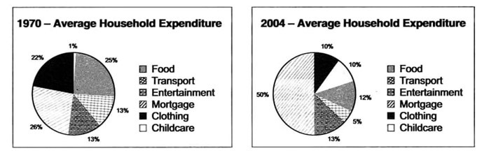
Topic: The pie charts below give information about the household expenditure of an average US family in different years.
Summarise the information by selecting and reporting the main features, and make comparisons where relevant.
My essay
The pie charts compare the total expenditure of one typical household in the US in six different categories, surveyed in 1970 and 2004.
Overall, there was some significant change in terms of the average money allocation among groups, with spending on childcare, mortgages rose while others tended to narrow the budget.
In 1970, there was an equal proportion for three common categories, with approximately a quarter of total expense paid for mortgage, clothing, and food for each kind. By contrast, by 2004, the percentage of money allocation for mortgage accounted for half of the total expenditure, twofold higher than its initial level. The proportion spent on both food and clothing halved to 12% and 10% respectively and 8% less of the total income was taken up by transport cost (5% in 2004). Meanwhile, expenditure on entertainment remained the same at 13% after 35 years. The 2014 family allocated 10 times more of the budget in terms of childcare.
Top answer
Please check my essay, thank you so much.
- Please check my essay, thank you so much.
Get the Weekly English Kit 📬
New words, one handy idiom, and a 2-minute quiz — delivered to your inbox to keep your streak alive.
 Related Questions