
Please review my task. Thanks for your help.
TOPIC
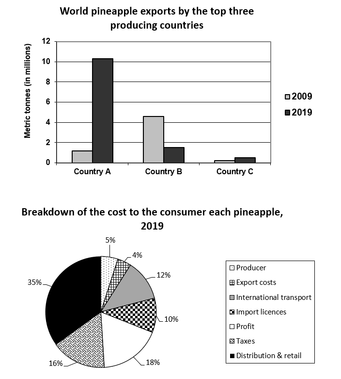
The charts show world pineapple exports by the top three pineapple-producing countries in 2009 and 2019, and a breakdown of the cost to the consumer of each pineapple in 2019.
Summarise the information by selecting and reporting the main features, and make comparisons where relevant.
My essay
The bar chart displays the world pineapple exports produced by the top three countries in 2009 and 2019. Meanwhile, the pie chart gives information about the breakdown of the cost to the consumer of each pineapple in 2019.
Overall, the export of country A peaked highest at more than ten metric tonnes of pineapple in 2019. Additionally, 35% of the cost breakdown of each pineapple in the three countries was for distribution along with retail.
As can be seen, world pineapple exports in 2019 were quite slightly with two remains, just less than two metric tonnes, and even nearly zero regard to country C. Back then a decade, the exports were fewer while the largest was just 4,4 metric tonnes of country B.
Getting to the pie chart, it can be observed that the cost came from several factors. The second with the percentage reach highs of 18% was profit and the latter were taxes, international transport, import licenses respectively and so on. Meantime, the smallest proportion was export costs which up to 4%.
Top answer
The bar chart displays the world pineapple exports (What are the units of measure? ) produced by the top three countries in 2009 and 2019. Meanwhile, the pie chart gives information about (That is too vague and non-specific) the a breakdown of the cost to the consumer of each pineapple in 2019.
- The bar chart displays the world pineapple exports (What are the units of measure?
- ) produced by the top three countries in 2009 and 2019.
- Meanwhile, the pie chart gives information about (That is too vague and non-specific) the a breakdown of the cost to the consumer of each pineapple in 2019.
- ) ) highest at more than ten metric tonnes of pineapple in 2019.
- ) was for distribution along with retail .
Get the Weekly English Kit 📬
New words, one handy idiom, and a 2-minute quiz — delivered to your inbox to keep your streak alive.
The bar chart displays the world pineapple exports (What are the units of measure? Number of pineapples?) produced by the top three countries in 2009 and 2019. Meanwhile, the pie chart gives information about (That is too vague and non-specific) the a breakdown of t
 Related Questions