
Please review my task 1! Thank you a lot!
Here is my essay:
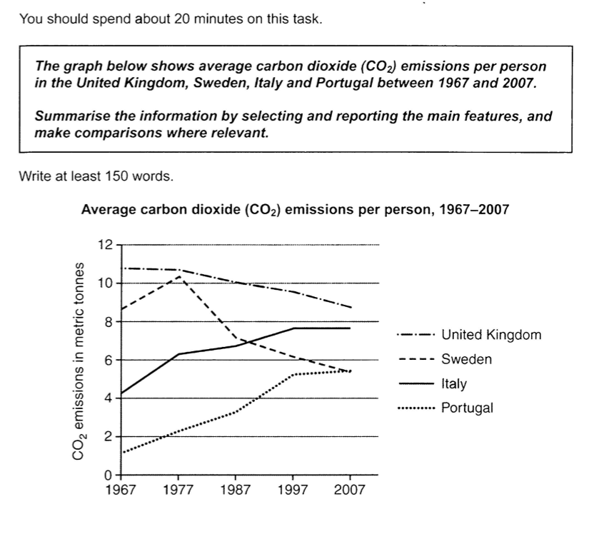
The line graph represents the average amount of carbon dioxide emissions per person in 4 countries of United Kingdom, Sweden, Italy and Portugal over a period of 40 years (1967-2007).
Overall, the average carbon dioxide emissions produced per person in the UK is the highest during the period shown. Also, in Italy and Portugal, the production of CO2 emissions per person increased dramatically, while the average amount in the UK and Sweden decreased constantly.
In early 1967, an English produce nearly 11 metric tonnes and then declined gradually at about 9 metric tonnes for the rest of the period. In the meantime, the average amount of CO2 emissions per person in Sweden increased and reached a peak of above 10 in 1977. Between 1977 and 2007, it showed a downward trend by around 4.
Meanwhile, the average production of CO2 emissions in Portugal and Italy showed a upward trend during the period. In 2007, an Italian and Portuguese produced at nearly 8 and above 7 metric tonnes respectively.
Top answer
Please read my advice for Task 1 essays: IELTS TASK 1: Hints, Tips And Advice Vocabulary Words For Task 1: Reference Post
- Please read my advice for Task 1 essays: IELTS TASK 1: Hints, Tips And Advice Vocabulary Words For Task 1: Reference Post
Get the Weekly English Kit 📬
New words, one handy idiom, and a 2-minute quiz — delivered to your inbox to keep your streak alive.
Please read my advice for Task 1 essays:
The line graph represents (Not a natural verb here.) gives / shows / plots / compares the average amount of carbon dioxide emissions per person in 4 four countries, of United Kingdom, Sweden, Italy and Portugal, over a peri
Sample essay
The line graph compares the average number of metric tonnes (MT) of carbon dioxide released annually per person in four European countries (The UK, Sweden, Italy and Portugal) over a 40-year period, 1967 to 2007.
During the first thirty years, two countries (Portugal and Italy) showed an increase, and the other two (The UK and Sweden) had a decrease. A
 Related Questions