
Please review my Task 1 - Bar chart [S_1B_03]
The given bar chart compares the typical daily amount of SO2 and N2O which cause air pollution in four different areas in the year 2000.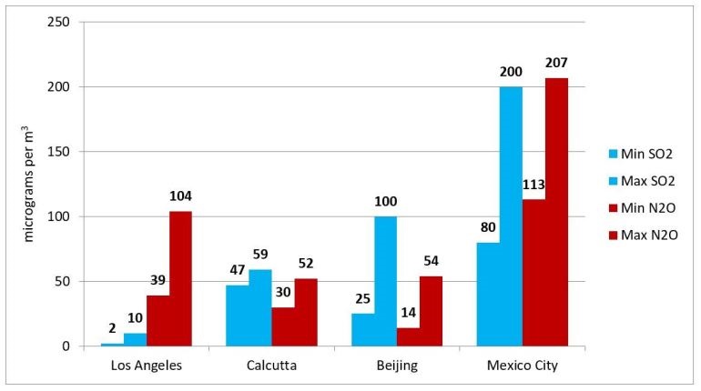
The given bar chart compares the typical daily amount of SO2 and N2O which cause air pollution in four different areas in the year 2000
Overall, Mexico City had the highest average levels of both pollutants. It is also apparent that the disparity between the four figures was the most modest in Calcutta.
Turning to detail, the largest and smallest quantities of SO2 and N2O released in Los Angeles followed an ascending order, 2 mcg/m3, 10 mcg/m3, 39 mcg/m3, and 104 mcg/m3, respectively. Meanwhile, in Mexico City, the amount of N2O peaked at approximately 207 mcg/m3, nearly double that of Los Angeles. Although the maximum figure for SO2 was slightly smaller in this city, at 200 mcg/m3, it still suffered from the worst air quality among the four locations.
On the contrary, the amount of pollution caused by N2O eclipsed that of SO2 in Calcutta and Beijing. The data for Calcutta, in terms of both emissions, hovered between 30 and 60 mcg/m3, whereas Beijing witnessed figures varying from 14 to 100 mcg/m3.
Word count: 172 words
Top answer
I'm sorry for the careless mistake. The topic is supposed to be this one, and I already paraphrased it. Please take a look at this topic instead of the post above.
- I'm sorry for the careless mistake.
- The topic is supposed to be this one, and I already paraphrased it.
- Please take a look at this topic instead of the post above.
- Thank you.
- TASK 1 - BAR CHART - #03 The chart below shows the average daily minimum and maximum levels of two air pollutants in four big cities in 2000.
Get the Weekly English Kit 📬
New words, one handy idiom, and a 2-minute quiz — delivered to your inbox to keep your streak alive.
I'm sorry for the careless mistake. The topic is supposed to be this one, and I already paraphrased it. Please take a look at this topic instead of the post above. Thank you.
TASK 1 - BAR CHART - #03
The chart below shows the average daily minimum and maximum levels ofThe given bar chart (Do not use "given" or "provided." This is not native English.) compares the typical daily amount (wrong form - these two gasses are not combined into one single measurement. ) of SO2 and N2O which cause air pollution (You must set this clause of
 Related Questions