
Please, review my Task 1
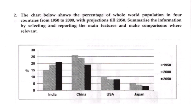
The bar chart compares and contrasts the changes in the proportion of population in China, India, the USA and Japan between 1950 and 2000 with future projections for 2050.
Overall, China accounted for the largest percentages of world's population ,however, these figures are predicted to decrease with India taking the lead in the next five decades. Similarly, a reduction in population numbers will likely to be seen among Americans and Japanese whose people make up all time low percentages.
It can be noticed that countries each having more than a fifth of world's population, namely China and India, indicate a reverse trend. The former had about a quarter percent of total population share in 1950 and 2000, but in the next fifty years, the figure is likely to drop to about 18%. By contrast, the latter rose from 15% to a moderate 18% in the first five decades and it will continue to increase to reach the highest level of more than 20%, surpassing China with a slight difference till 2050.
Turning to the countries indicating less than 10% in their population rates, the percentage of Americans declined from 10% to about 7% in 2000 and it is expected to remain unchanged. The remaining category, Japan, which is responsible for the lowest proportions , is said to be under 5% by 2050.
Top answer
The bar chart compares and contrasts the changes in the proportion of population (Not a good phrase - you need to say that is the proportion of the entire world's population) in China, India, the USA and Japan in between 1950 and 2000 with a forecast future projections for 2050. Overall, China accounted for the largest percentages of world's populatio n ,h owever, (wrong spacing, comma splice error, ungrammatical sentence) these figures (wrong word) are it is predicted to decrease with India taking the lead in the next five decades . (There are no values for decades - 2010, 2020, 2030 or 2040) Similarly, a reduction in population proportions numbers will likely to be seen among Americans and Japanese whose people make up less than 10%.
- The bar chart compares and contrasts the changes in the proportion of population (Not a good phrase - you need to say that is the proportion of the entire world's population) in China, India, the USA and Japan in between 1950 and 2000 with a forecast future projections for 2050.
- Overall, China accounted for the largest percentages of world's populatio n ,h owever, (wrong spacing, comma splice error, ungrammatical sentence) these figures (wrong word) are it is predicted to decrease with India taking the lead in the next five decades .
- (There are no values for decades - 2010, 2020, 2030 or 2040) Similarly, a reduction in population proportions numbers will likely to be seen among Americans and Japanese whose people make up less than 10%.
- all time low percentages.
- It can be noticed that The countries each having more than a fifth of world's population, namely China and India, indicate a reverse show opposite trend s.
Get the Weekly English Kit 📬
New words, one handy idiom, and a 2-minute quiz — delivered to your inbox to keep your streak alive.
The bar chart compares and contrasts the changes in the proportion of population (Not a good phrase - you need to say that is the proportion of the entire world's population) in China, India, the USA and Japan in between 1950 and 2000 with a forecast
 Related Questions