
Please review my IELTS Writing Task 1 Line Graph. Thank you so much
Subject: The graph below shows the proportions of workers in three different sectors in South Korea between 1981 and 2011. Summarise the information by selecting and reporting the main features, and make comparisons where relevant.
————————————————————
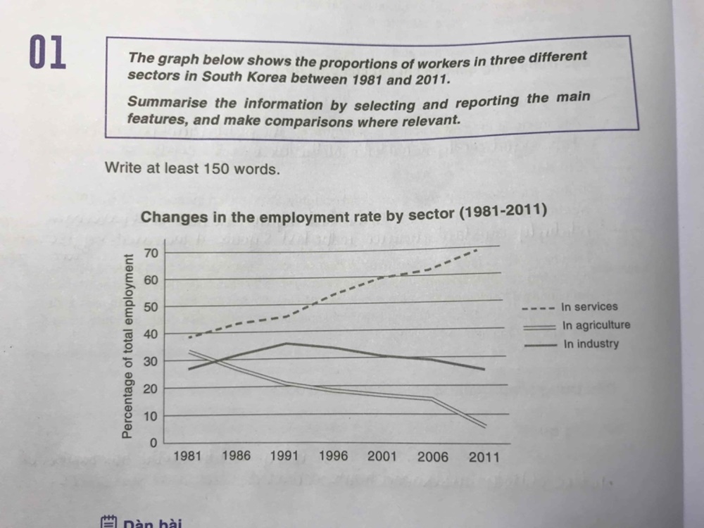
The line graph illustrates South Korea’s percentage of employees in various categories (services, agriculture and industry) over the course of 20 years, starting in 1981.
Looking at the graph, it is immediately obvious that the employment rate experienced a significant change, with the exception of industry. Services registered the highest figure over the period.
Services’ percentage accounted for approximately 40 percent in 1981. This figure rose dramatically before reaching the highest point of almost equal to seventh-tenth in the end, which was nearly doubled the beginning. However, a reverse pattern was seen in agriculture’s jobs market. The proportion underwent a notable dip from precisely a third to more than 5% in 2011.
In terms of industry, there was an insignificant change in the workers' proportion. In the first ten year-period, the number witnessed a steady increase and peaked at just more than 35 percent, which surpasses the agriculture’s percentage. This was followed by a gradual decrease to the beginning level.
WRITE DESCRIPTION HERE
Top answer
You have the usual vocabulary mistakes in this Task 1 essay. Please read my advice for Task 1 essays: IELTS TASK 1: Hints, Tips And Advice Vocabulary Words For Task 1: Reference Post Next, there are some serious problems in the graph. Did you find them?
- You have the usual vocabulary mistakes in this Task 1 essay.
- Please read my advice for Task 1 essays: IELTS TASK 1: Hints, Tips And Advice Vocabulary Words For Task 1: Reference Post Next, there are some serious problems in the graph.
- Did you find them?
- Do not use practice essays with defective graphs.
- Also, the instructions are not written in native English.
Get the Weekly English Kit 📬
New words, one handy idiom, and a 2-minute quiz — delivered to your inbox to keep your streak alive.
You have the usual vocabulary mistakes in this Task 1 essay.
Please read my advice for Task 1 essays:
 Related Questions