
Please review my IELTS writing task 1
The graph below shows the figures for population distribution in the Northwest region for 1900-2050. Summarize the information by selecting and reporting the main features, and make comparisons where relevant.
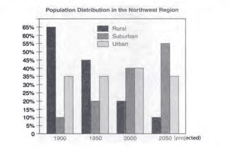
The grouped bar chart plots how the population was spread across the Northwest region, divided into rural, urban, and suburban areas, every five decades from 1900 to 2000. The projections for 2050 are also shown.
Overall, suburbs became increasingly populous, whereas rural areas trended in the opposite direction. Only in urban districts did the population remain roughly constant relative to the total. All of these trends are forecast to continue into 2050.
To be specific, rural areas surpassed the suburbs in population size at the beginning. In 1900, 65% of people lived in the countryside, more than four times the percentage of people living in the suburbs. However, the situation was reversed in 2000, when rural residents made up only 20% of the population, half the percentage of suburban residents at 40%. The rural-suburban gap is expected to widen to 10% versus 55% in 2050. By comparison, urban dwellers accounted for 35% of the population in 1900 and 1950, a proportion that rose to 40% in 2000, equal to that of suburban residents. However, based on projections, it will slide back to 35% in 2050.
Top answer
The grouped bar chart plots how the percentage of population in was spread across the Northwest region, in three areas: divided into rural, urban, and suburban areas , every five decades from 1900 to 2000. The projections for 2050 are also shown. you can also divide the two sentences like this: The bar chart plots where people were living in the Northwest Region in 1900, 1950 and 2000 with a forecast to 2050.
- The grouped bar chart plots how the percentage of population in was spread across the Northwest region, in three areas: divided into rural, urban, and suburban areas , every five decades from 1900 to 2000.
- The projections for 2050 are also shown.
- you can also divide the two sentences like this: The bar chart plots where people were living in the Northwest Region in 1900, 1950 and 2000 with a forecast to 2050.
- In particular, it gives the percentage of the population in urban, suburban and rural areas.
- Overall, the suburbs became increasingly populous, offset by decreases in the countryside.
Get the Weekly English Kit 📬
New words, one handy idiom, and a 2-minute quiz — delivered to your inbox to keep your streak alive.
The grouped bar chart plots how the percentage of population in was spread across the Northwest region, in three areas: divided into rural, urban, and suburban areas, every five decades from 1900 to 2000. The projections f
 Related Questions