
Please Review my IELTS Writing Task 1
The line graph illustrates the proportion of exports in Australia to Japan, the United States, China, and India over a period of 22 years.
Overall, it is obvious that the percentage of Australian exports to China and India had an upward trend, whereas there was a downward trend in the other countries.
In 1990, the percentage of exporting from Australia to Japan was the highest in the four countries, about 22%. However, this figure decreased considerably to 20% in 1995 and then fell gradually to around 18% in 17 years later. There was an opposite trend witnessed in exporting to the China market, Australia exported approximately 2.5% of its goods in 1990, and increased slightly to 5% in 10 years later, then continued climbing dramatically to nearly 28% in 2012.
In the early years of the period, the proportion of Australian exports to the Indian market remained stable at 1% - the lowest percentage compared to the others. In 2010, this figure reached a peak at 7%, and over the American market. In 1990, the United States imported over 10% of Australia’s goods. However, this figure had a significant fluctuation, dropped to about 8% in 1995, then increased to over 10% in 2000 and hit the lowest point at 5% in 2010.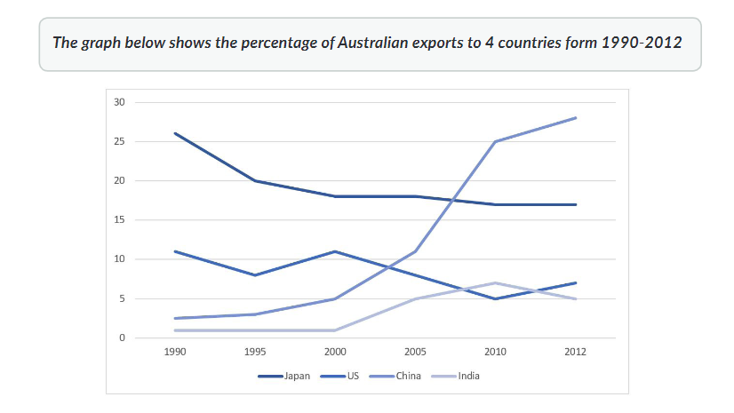
Top answer
Please read my advice for Task 1 essays: IELTS TASK 1: Hints, Tips And Advice Vocabulary Words For Task 1: Reference Post
- Please read my advice for Task 1 essays: IELTS TASK 1: Hints, Tips And Advice Vocabulary Words For Task 1: Reference Post
Get the Weekly English Kit 📬
New words, one handy idiom, and a 2-minute quiz — delivered to your inbox to keep your streak alive.
The line graph illustrates (Poor word choice. Read my advice.) the proportion of exports in (wrong preposition) Australia to Japan, the United States, China, and India over a period of 22 years. (Which 22 years? 1890-1912? 1900-1922? or something different? Do not confuse the reader.
 Related Questions