
Please review my IELTS WRITING TASK 1
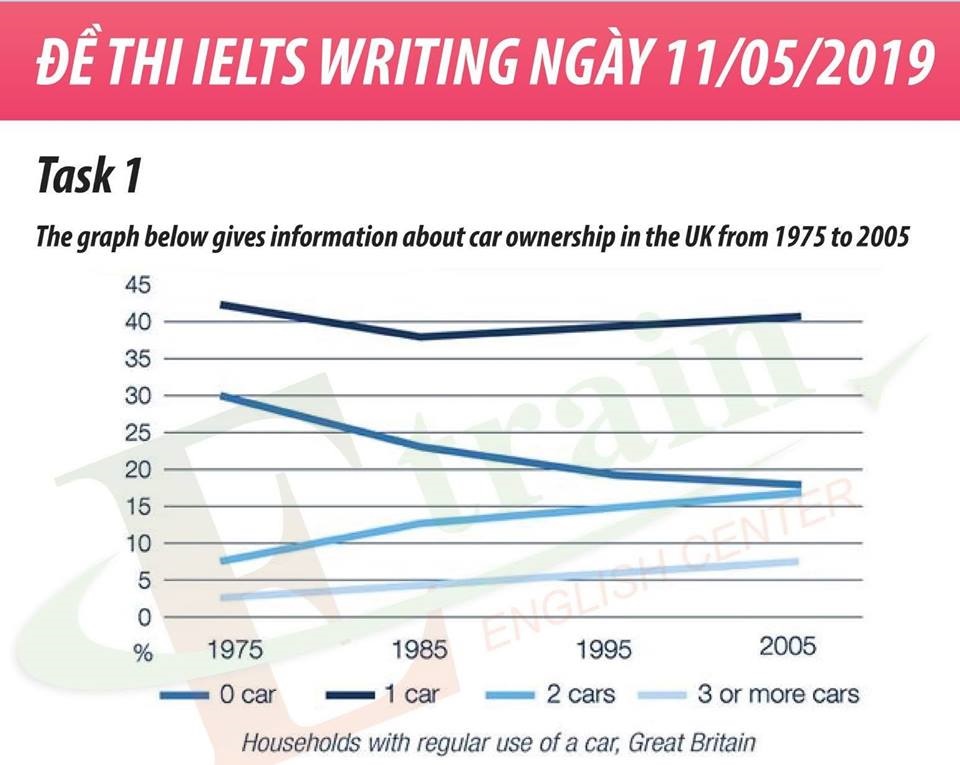
The line graph shows the changes in number of people owning their car in the UK between 1975 and 2005.
Overall, the number of people having 0 to 1 car decreased and had some variations, whereas households used from two to over three cars increased slightly, respectively.
In 1975, the number of people did not have any car was about 30%, but after this percentage decrease slightly by over 20% in 1985. However, at the end of the period, around 40% of households had no car to use, which accounted for two-fifths in the total. It was also not popular for families to own 2 or 3 cars, around from 8% to 17%.
On the other hand, the percentage of domestic using regularly 1 car had upward trend. At the beginning of the period, this proportion represented about 45%. After 20 years, there was a slight decrease in one car used. However, there has a small change in 2005. The number of families processing one car reached 45%, which stood at the highest percentage in the total.
Top answer
The line graph shows the changes in the number (Wrong word. A number is an absolute value like 65,321, 92 or 3,984,435. ) of people owning their car (Wrong expression) in the UK between 1975 and 2005.
- The line graph shows the changes in the number (Wrong word.
- A number is an absolute value like 65,321, 92 or 3,984,435.
- ) of people owning their car (Wrong expression) in the UK between 1975 and 2005.
- Your first paragraph is incomplete.
- You did not tell the reader what was on this graph.
Get the Weekly English Kit 📬
New words, one handy idiom, and a 2-minute quiz — delivered to your inbox to keep your streak alive.
The line graph shows the changes in the number (Wrong word. A number is an absolute value like 65,321, 92 or 3,984,435. This graph does not show numbers.) of people owning their car (Wrong expression) in the UK between 1975 and 2005.
 Related Questions